An interactive waterfront trail experience connecting visitors to the restoration of Te Ara Tukutuku — through signage, story markers, and a companion mobile website.
Our client AUDO challenged us to explore how digital media and innovative design could communicate the current Now / Healing phase of Te Ara Tukutuku — an environmental restoration project at Wynyard Quarter, Auckland. The goal was to help people understand the ongoing restoration of the site and strengthen their connection to the place before it fully opens to the public.
Tai Ora is a trail that guides visitors and families through key moments and interactions focused on the moana ecosystem, while leading them to the Te Ara Tukutuku hub.
AUDO runs events for Te Ara Tukutuku, yet awareness of the project remains low. Many people were still unaware of its existence or how to participate in restoring the moana. Existing signage on site was often skipped — people briefly glanced at information boards or ignored them entirely, suggesting low engagement with the current format.
My initial research focused on Te Ara Tukutuku as a long-term regeneration project centred on healing, restoration, and reconnection. Much of the current "now / healing phase" — including mussel and seaweed regeneration — is largely unseen by the public, which shaped Tai Ora's goal to make environmental regeneration more visible.
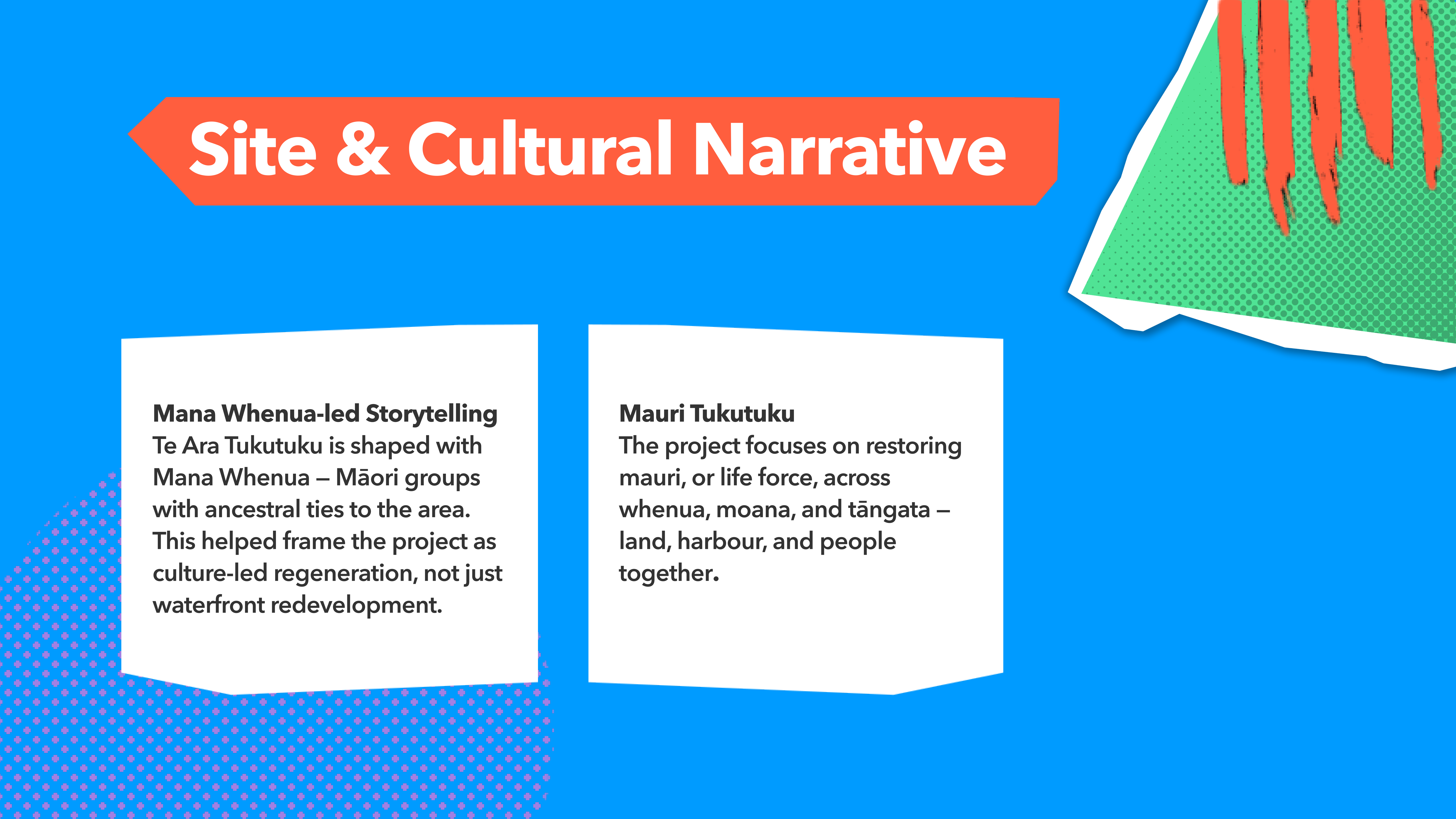
I also explored the cultural narratives behind the project, including Mana Whenua collaboration, mauri, kaitiakitanga, and the relationship between whenua, moana, and tāngata. This shaped Tai Ora's use of respectful storytelling, environmental care, and place-based visual markers.
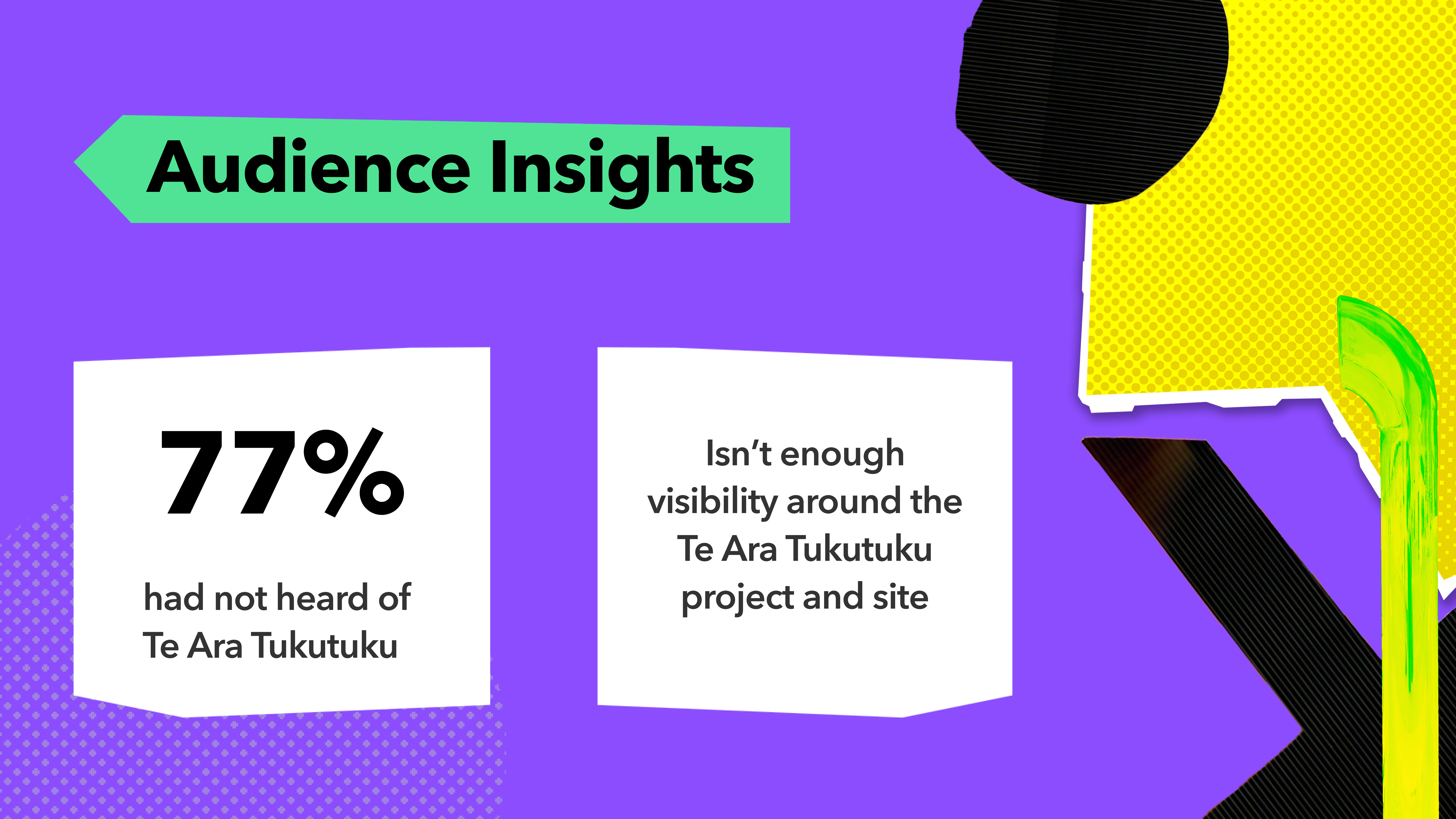
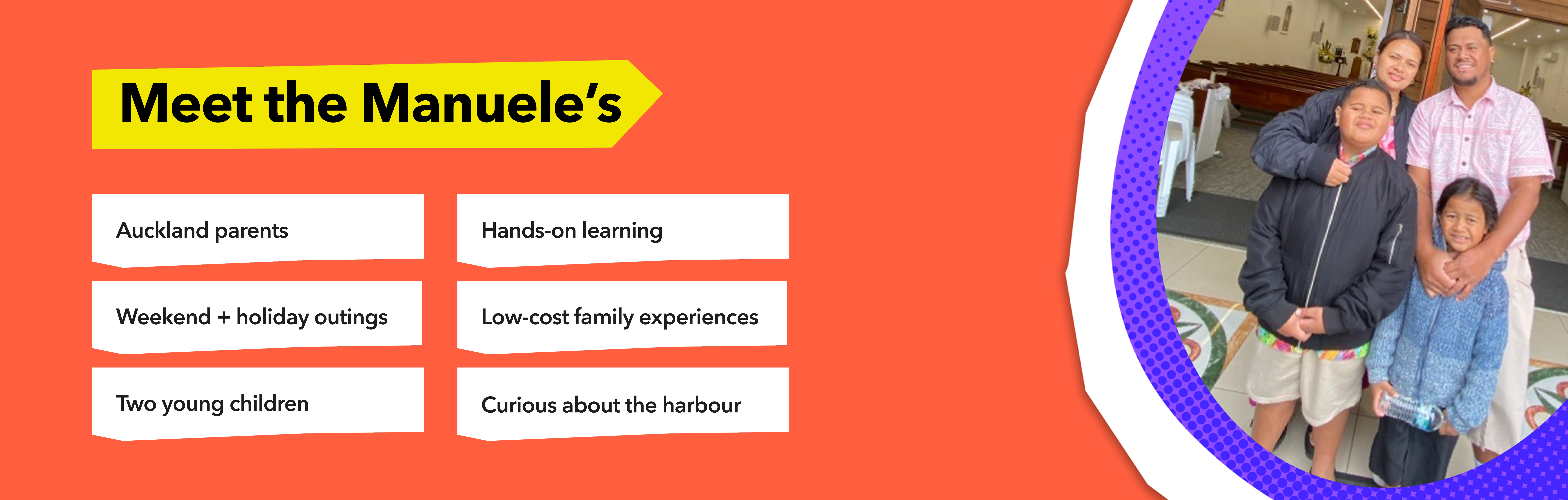
People already spending time in Wynyard Quarter — visitors, families, and locals who pass through the waterfront area but have little awareness of the restoration happening around them. The trail needed to meet them in the moment, not require prior knowledge or effort to find.
As Producer, I managed the project timeline, weekly tasks, and team milestones. As UX/UI Designer, I focused on the physical and digital touchpoints that helped visitors move through the Tai Ora trail.
My contribution included the signage system, wayfinding, story marker development, mobile website, poster extension, mockup refinement, and final presentation of the trail experience.
To shape the trail content, I researched mussel and seaweed regeneration, child-friendly learning prompts, and how visitors could engage with the moana restoration story through simple physical interactions. This helped define the key trail moments: hydro-art reveal points, the seaweed and mussel display, kid-friendly prompts, and clear language that made the regeneration story easier to understand.
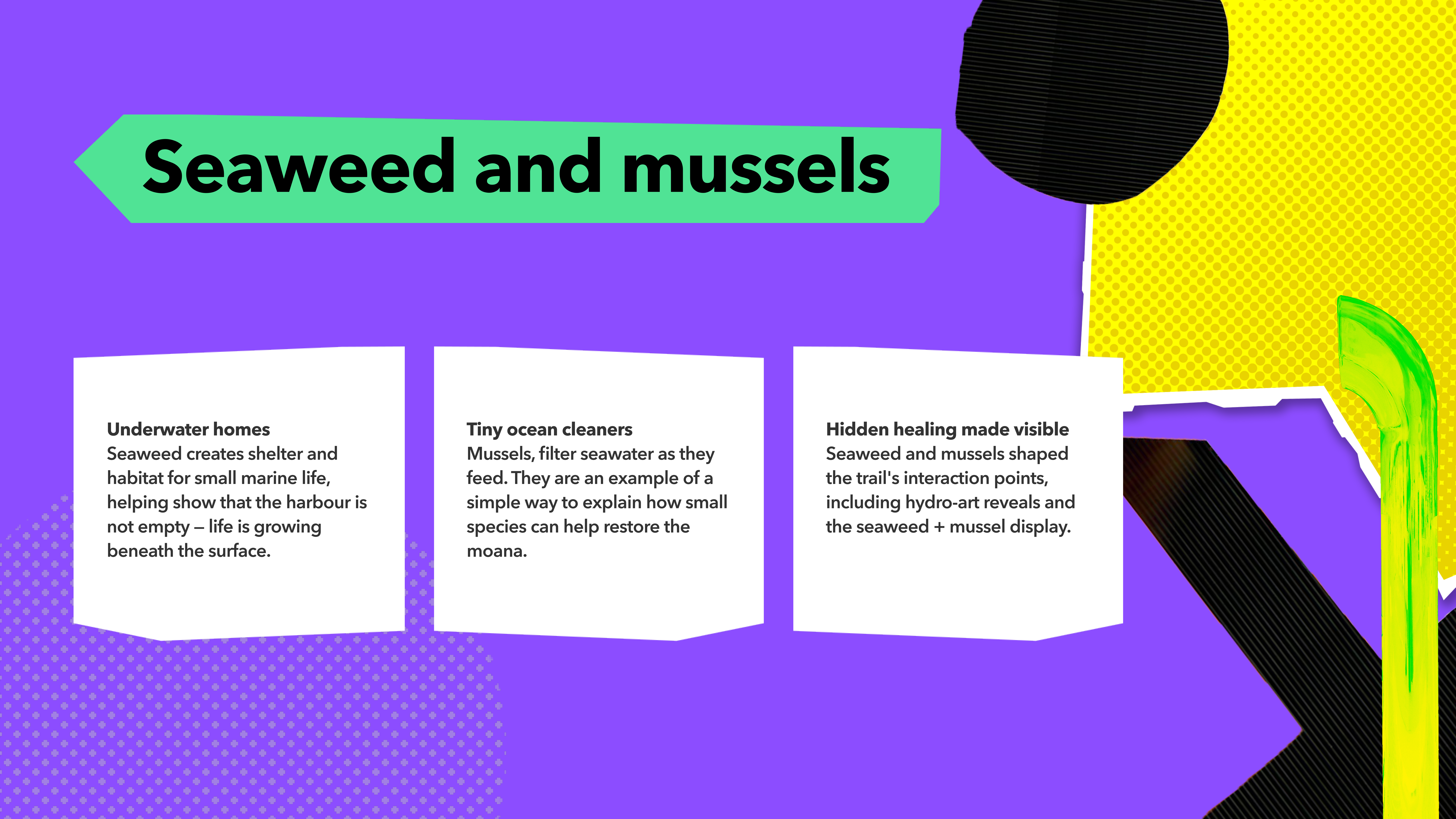
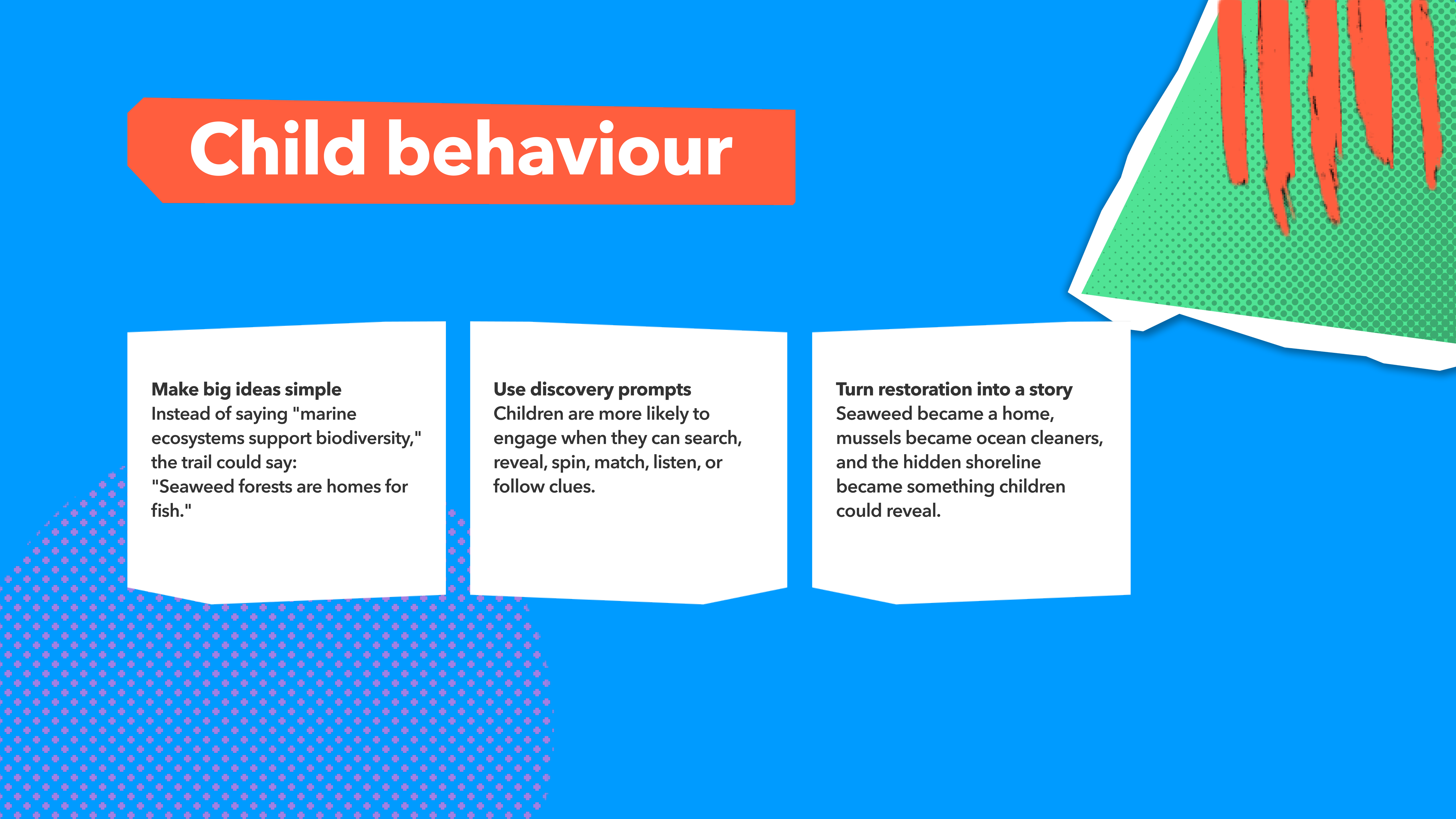
Research into marine regeneration and child-friendly interaction helped shape the trail's physical touchpoints and signage language.
Before moving into individual signage components, I mapped out the full signage system — identifying every touchpoint across the trail, planning copy, and drafting layouts. This planning phase ensured each sign served a clear purpose and that the system worked as a coherent whole.
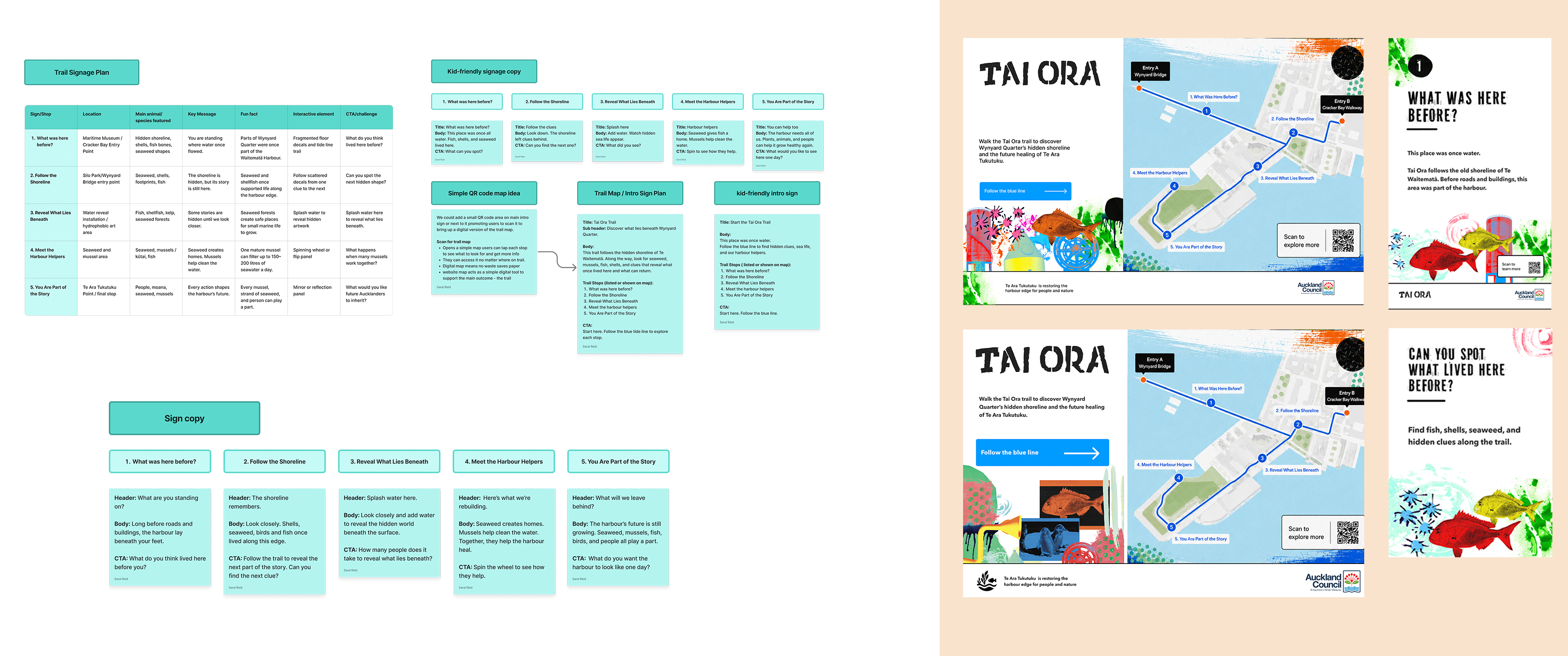
Signage system planning and early drafts — mapping every trail touchpoint before production.
I designed the entry signs for the Tai Ora trail — setting the tone and introducing the experience. Starting from early landscape iterations, I refined the layout, copy, and composition into the final portrait format used at two separate trail entry points.
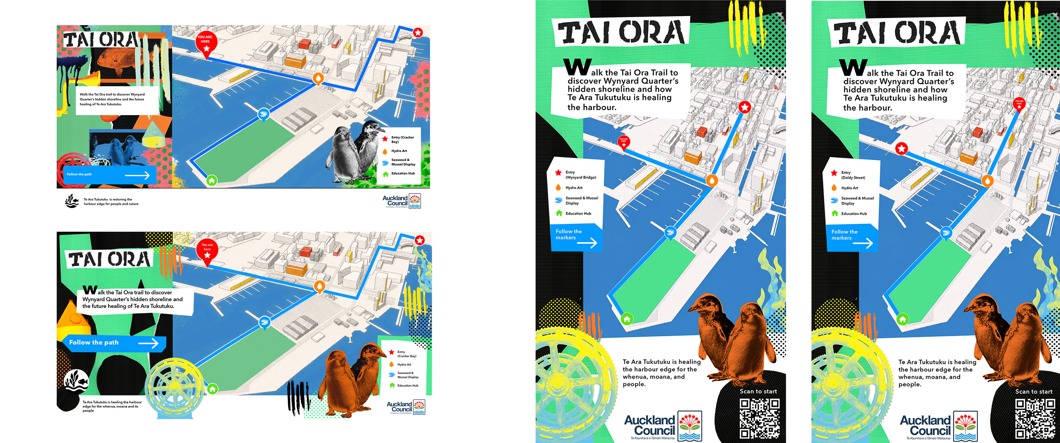
Entry sign development — from early landscape iterations to final portrait signs for two trail entry points.
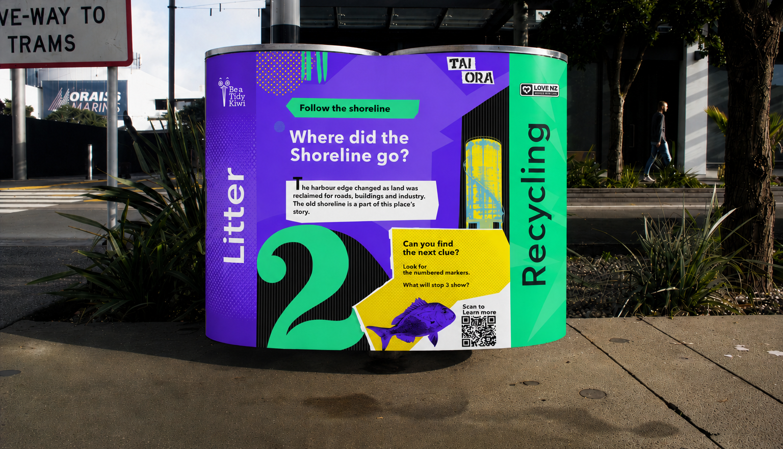
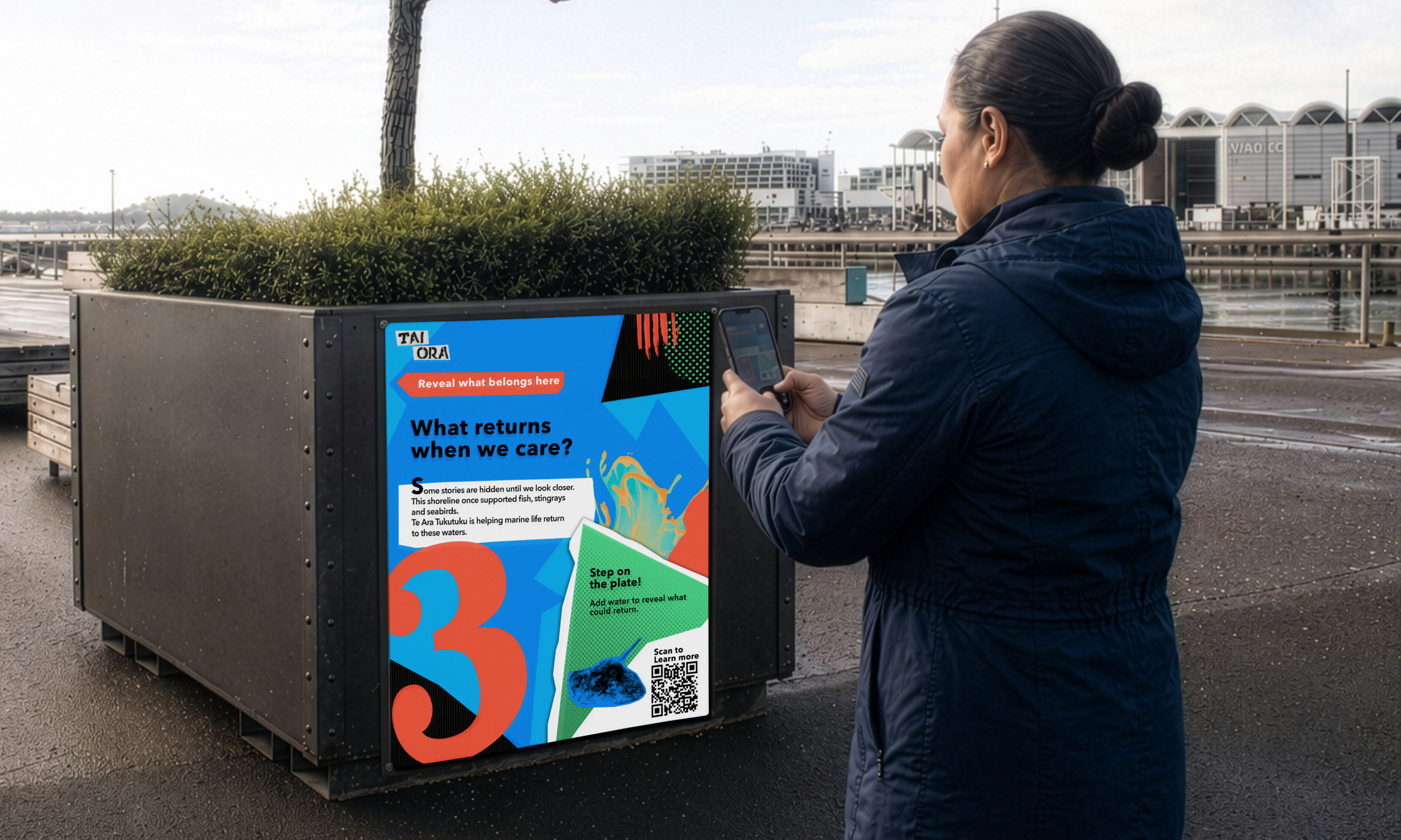
Individual story markers were developed for each key point on the trail — designed in both adult and kid versions to serve the full range of visitors. I then developed a joint story marker system that merged both into a single cohesive sign, refined through multiple rounds of layout, collage style, copywriting, and mockup placement testing.
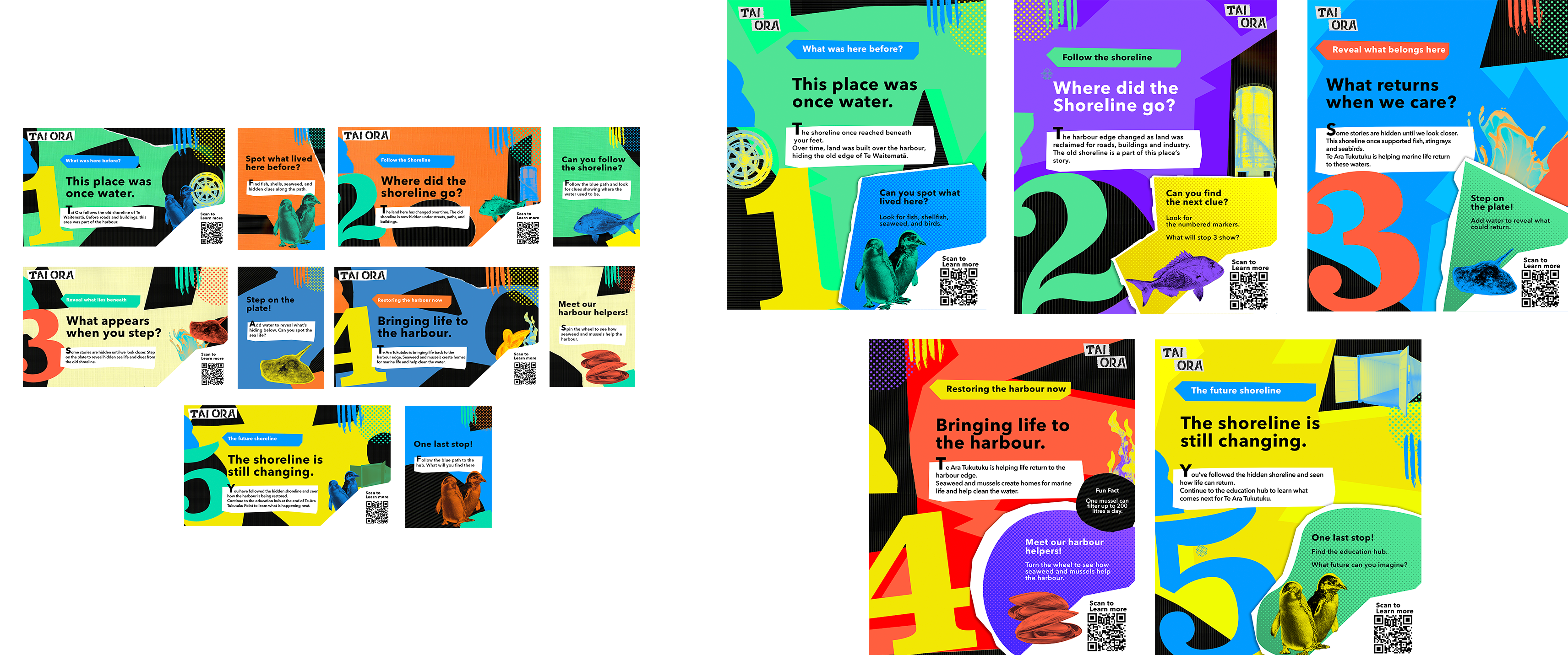
Individual and joint story markers — adult and kid versions refined into a single cohesive system.
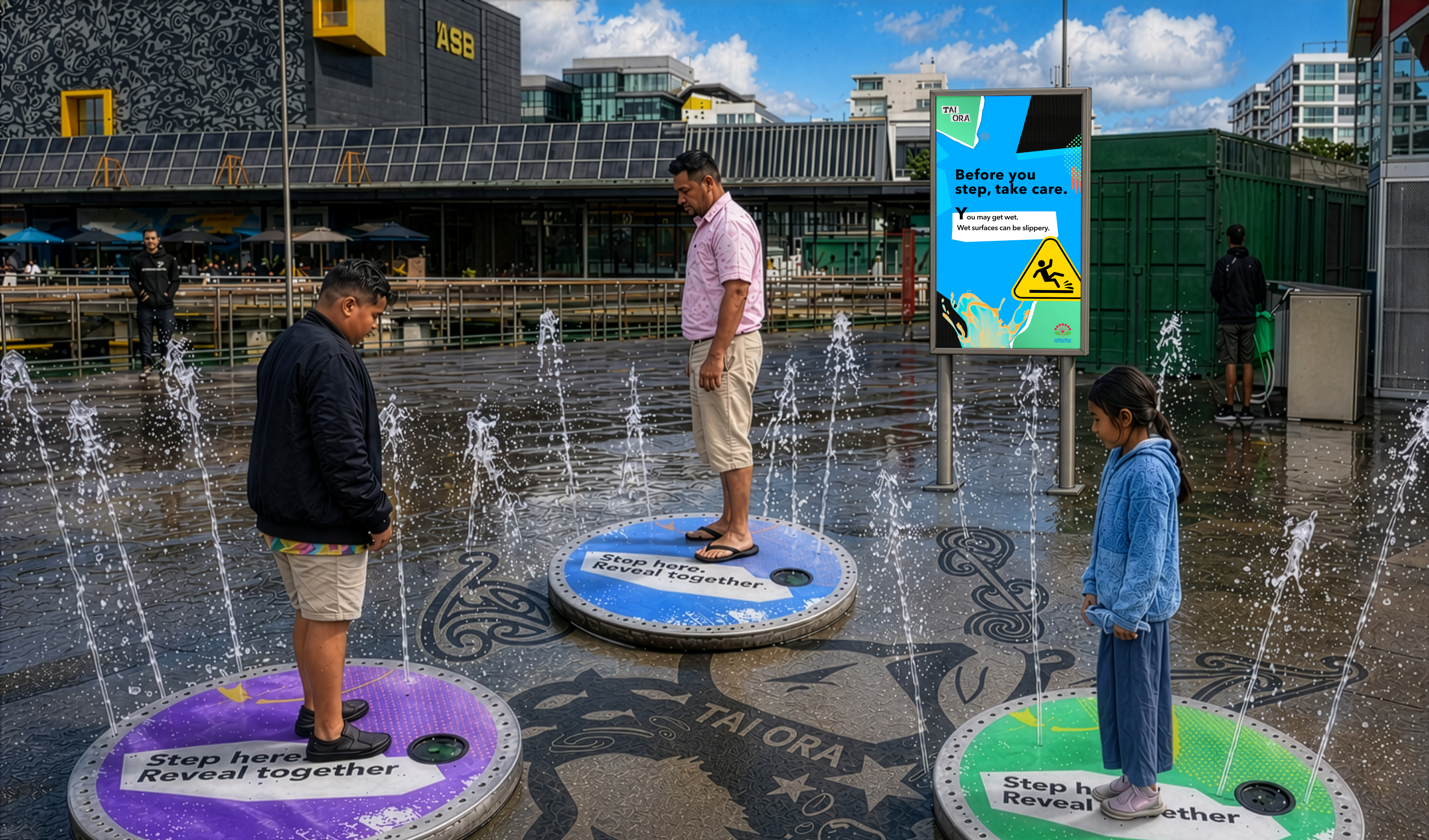
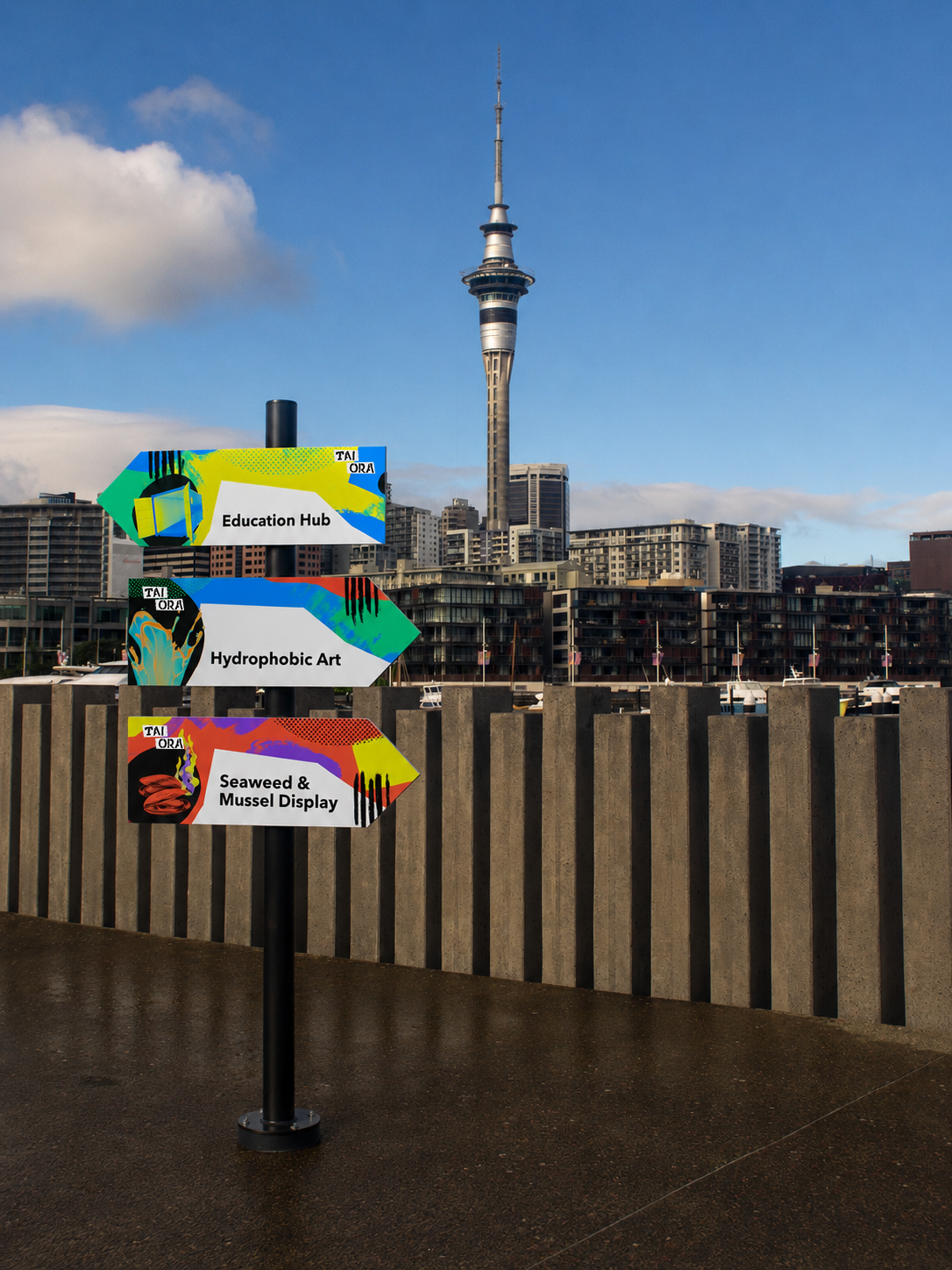
I designed directional signage for key trail locations and water safety signs for the hydro art interaction. Both went through development and refinement rounds — testing copy, iconography, layout, and colour — before reaching their final forms.
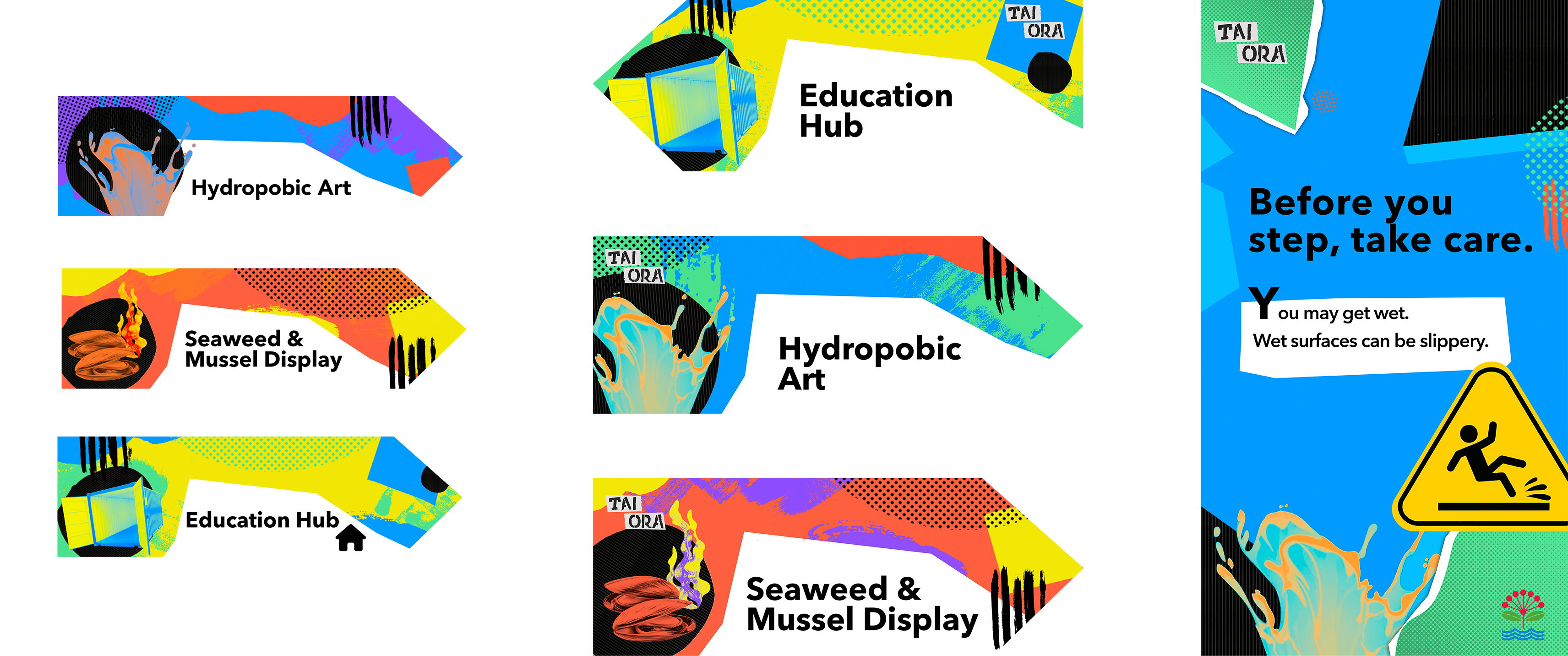
Directional and water safety signs — refined for clarity, readability, and in-context placement.
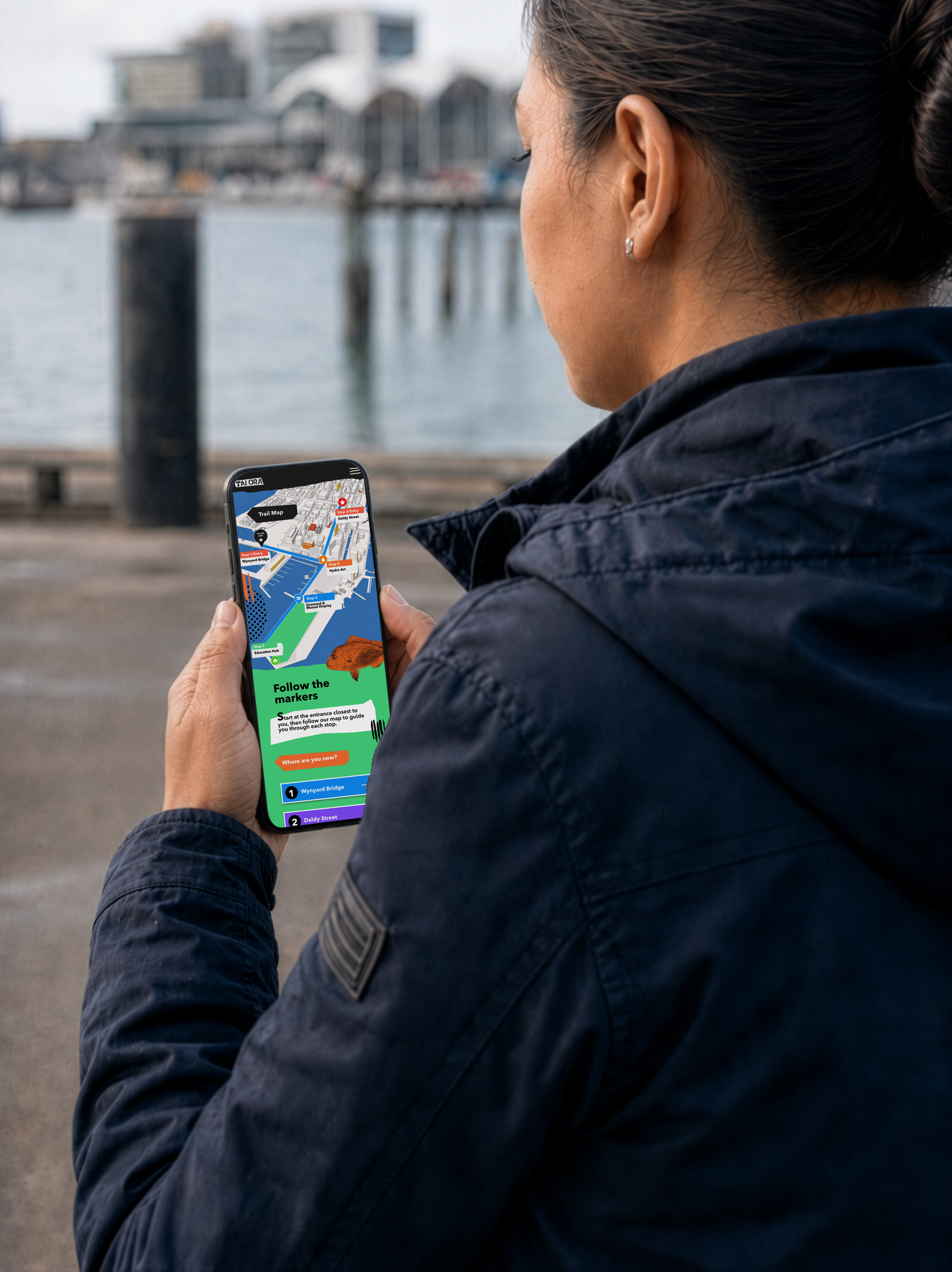
I designed the companion mobile website for Tai Ora — accessible via QR code on trail signage. I mapped the user flow, built a site map, developed lo-fi wireframes, then progressed through mid-fi and hi-fi screens. The site supports visitors in following the trail, learning more, and accessing the interactive trail map.
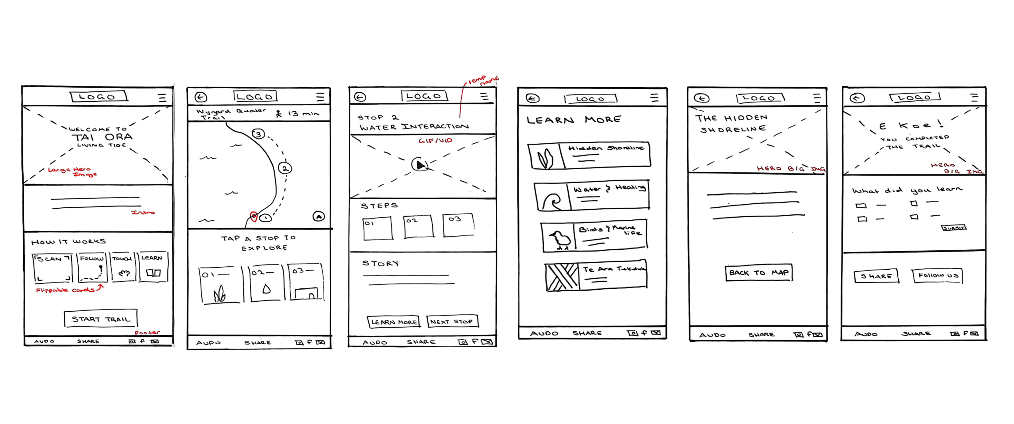
Paper prototypes — early ideation and flow testing.
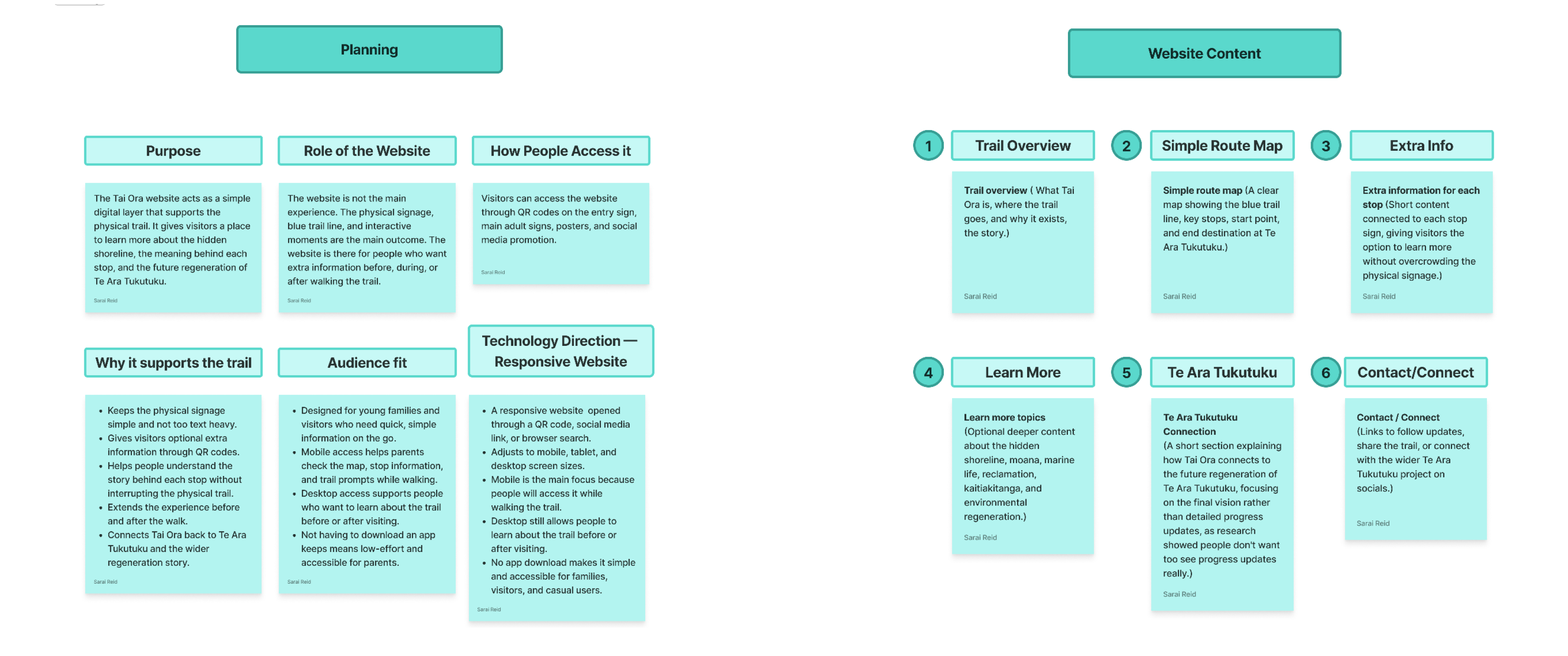
Planning & content mapping.
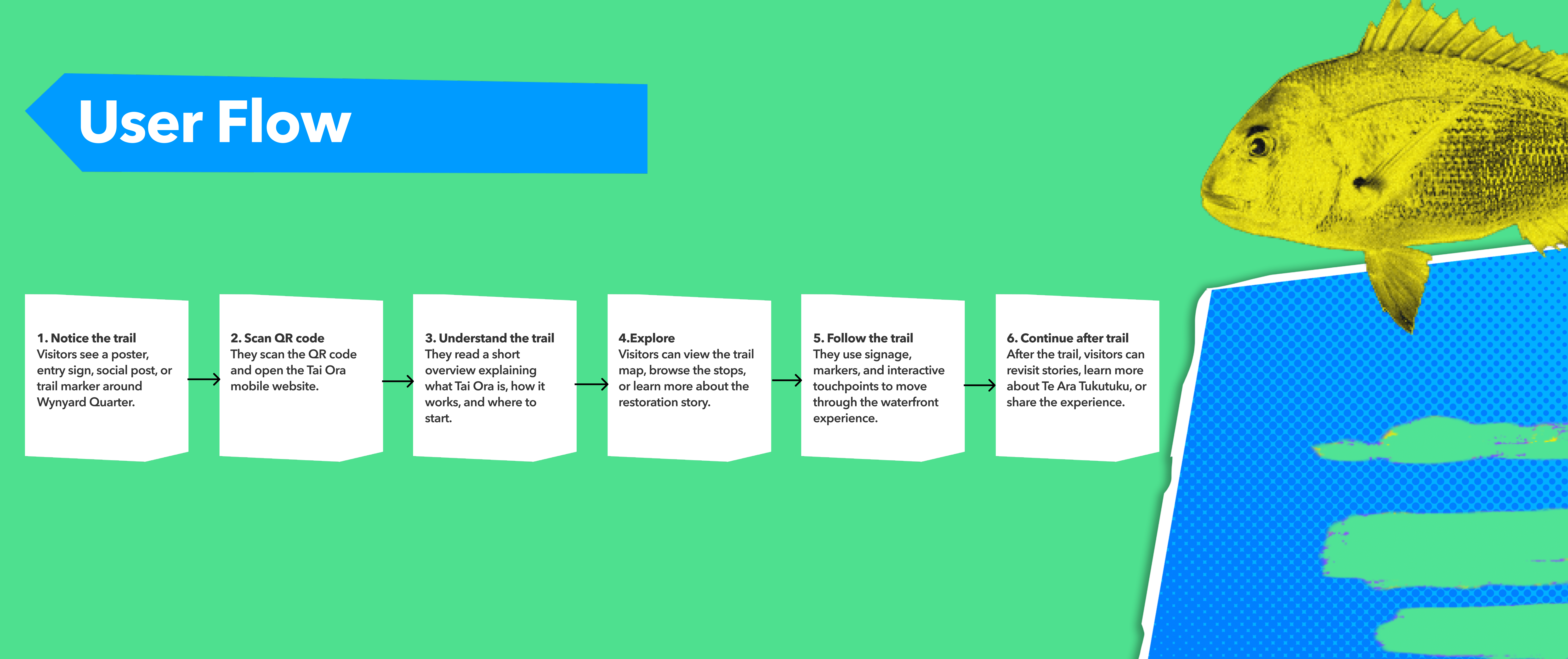
User flow — mapping the visitor journey through the site.
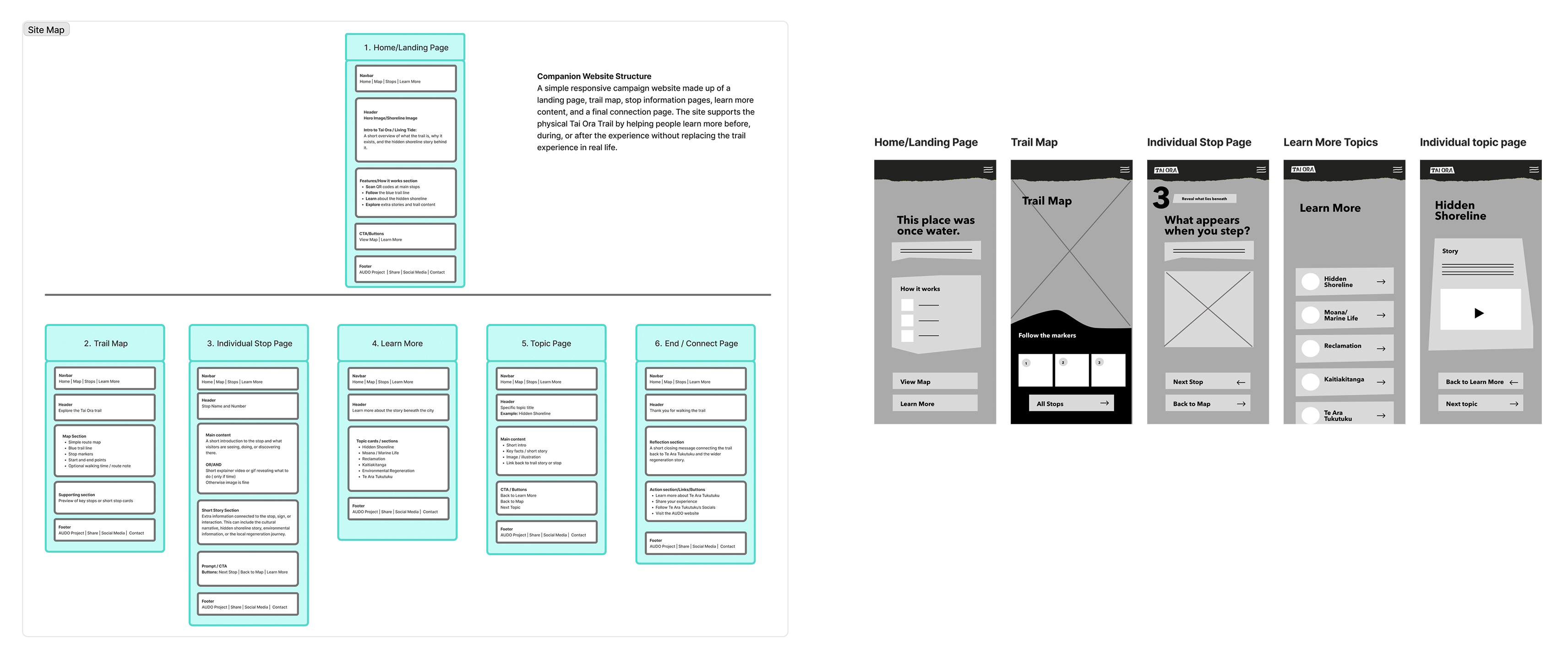
Site map & lo-fi wireframes — information architecture and early structure.
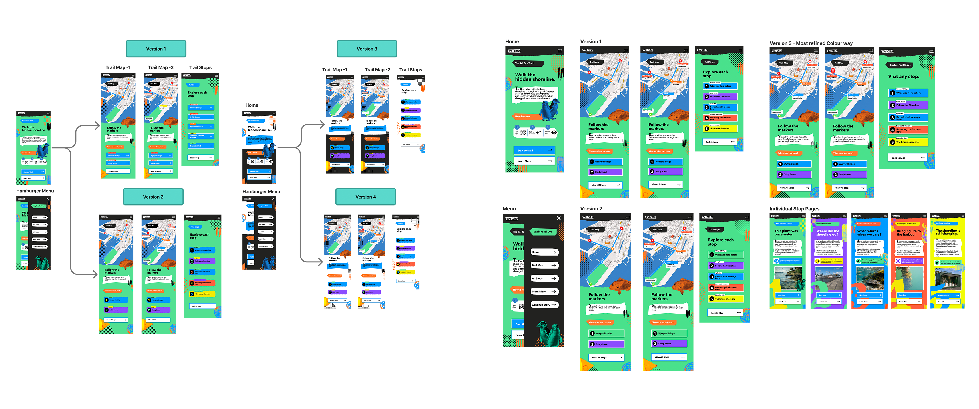
Mid-fi & refinement — testing and iteration.
Hi-fi screens — final mobile website design and interactive prototype.
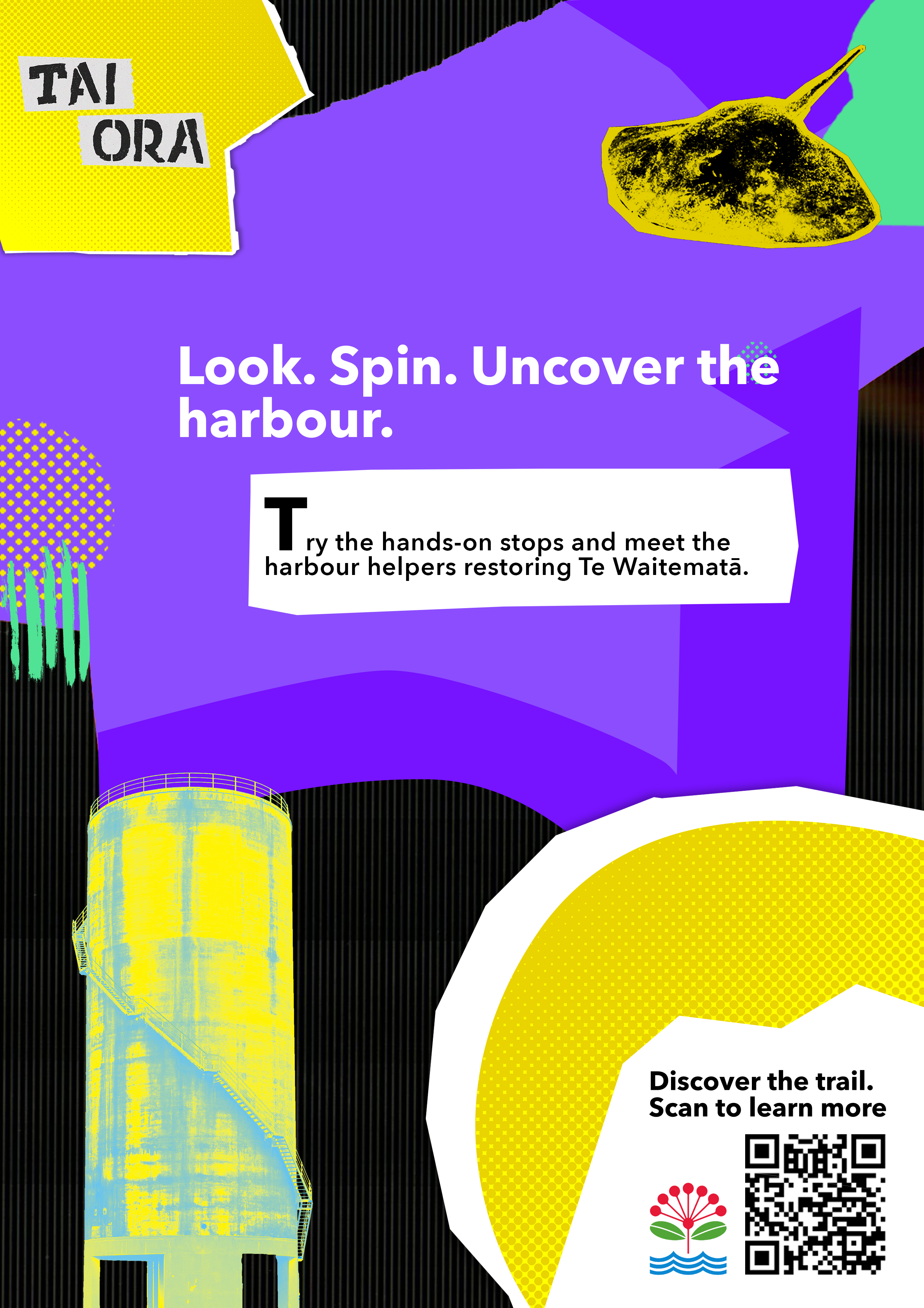
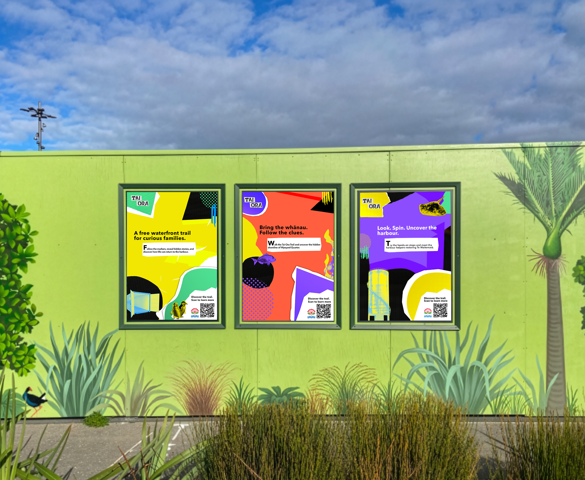
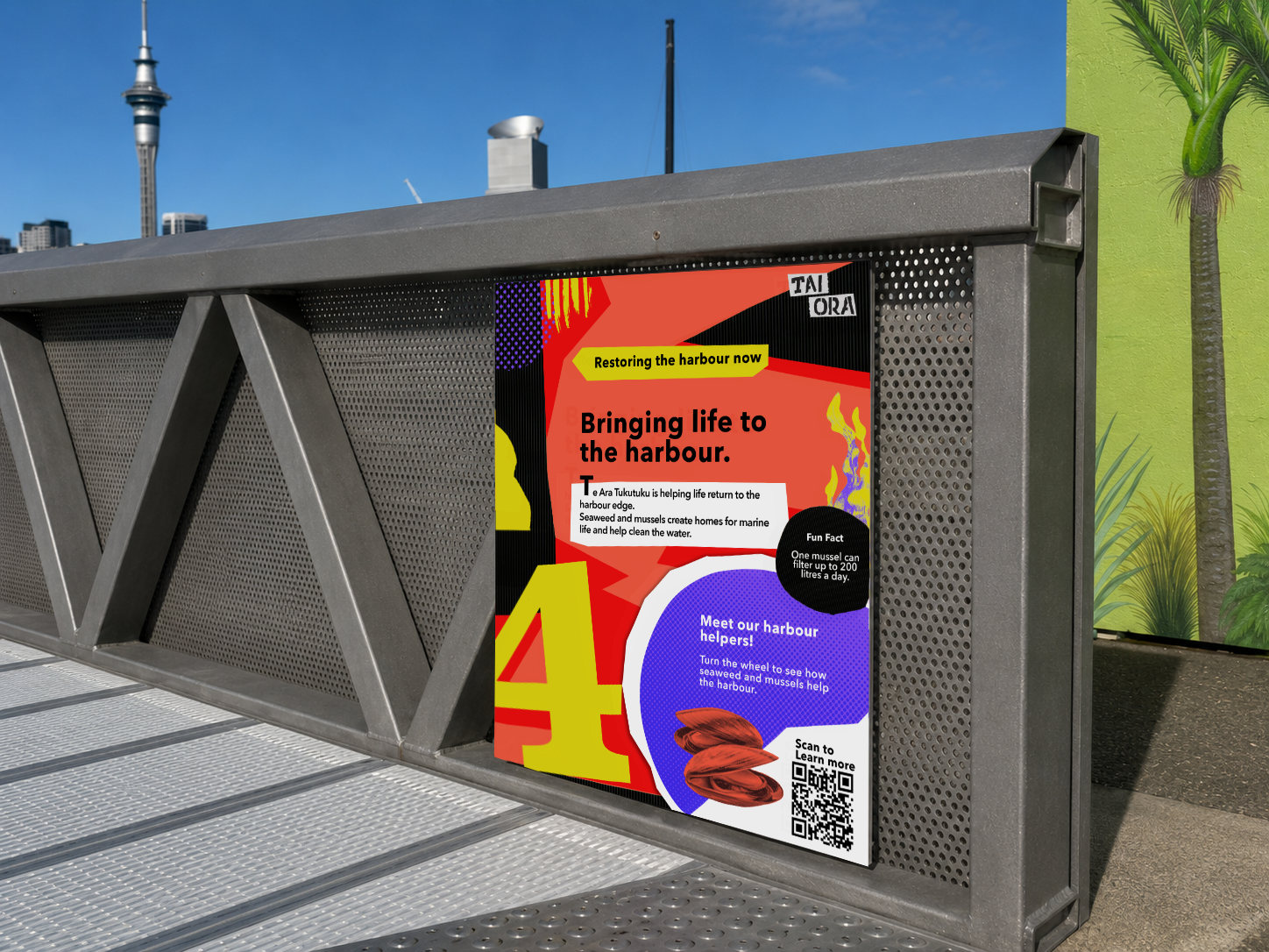
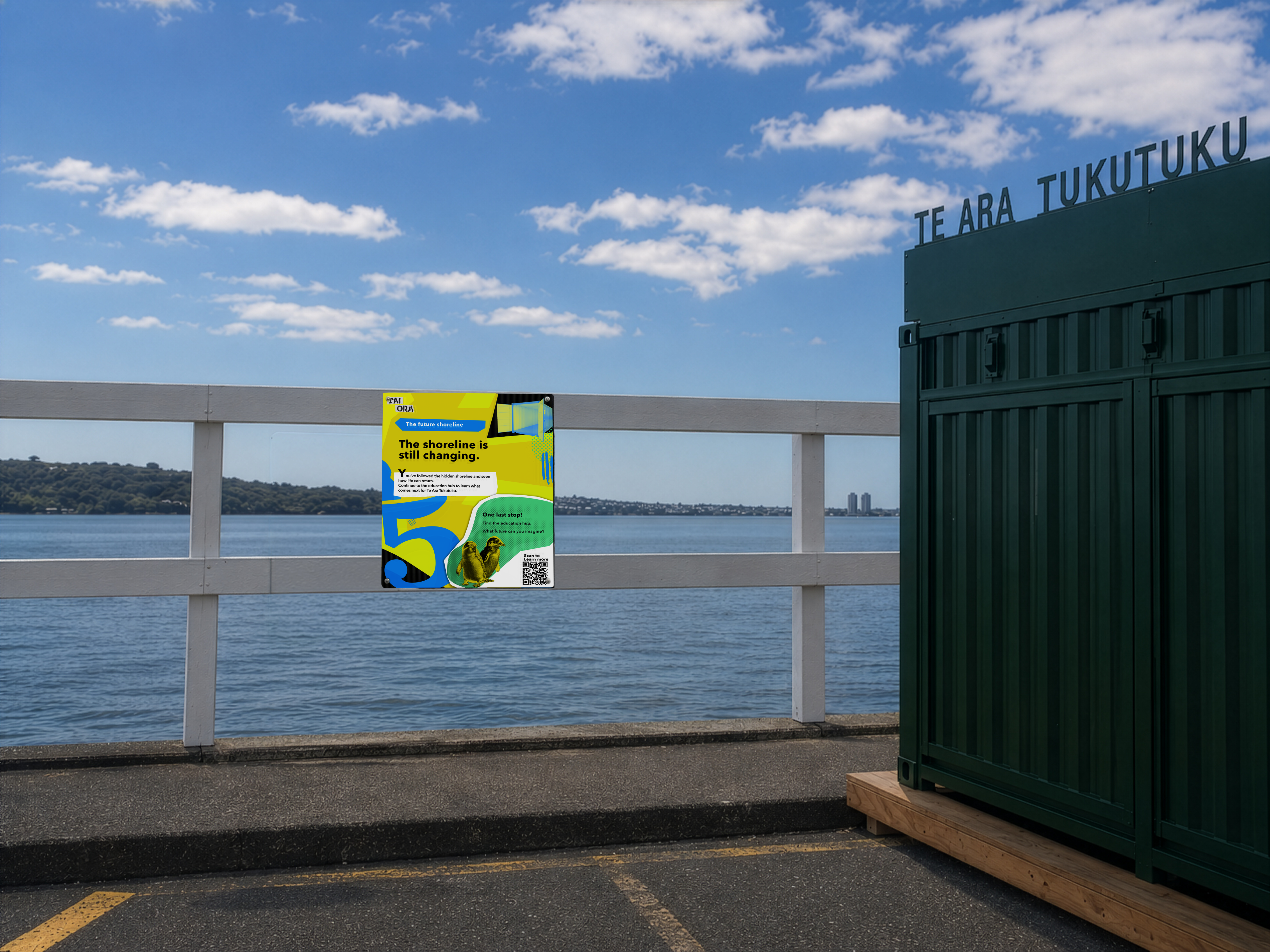
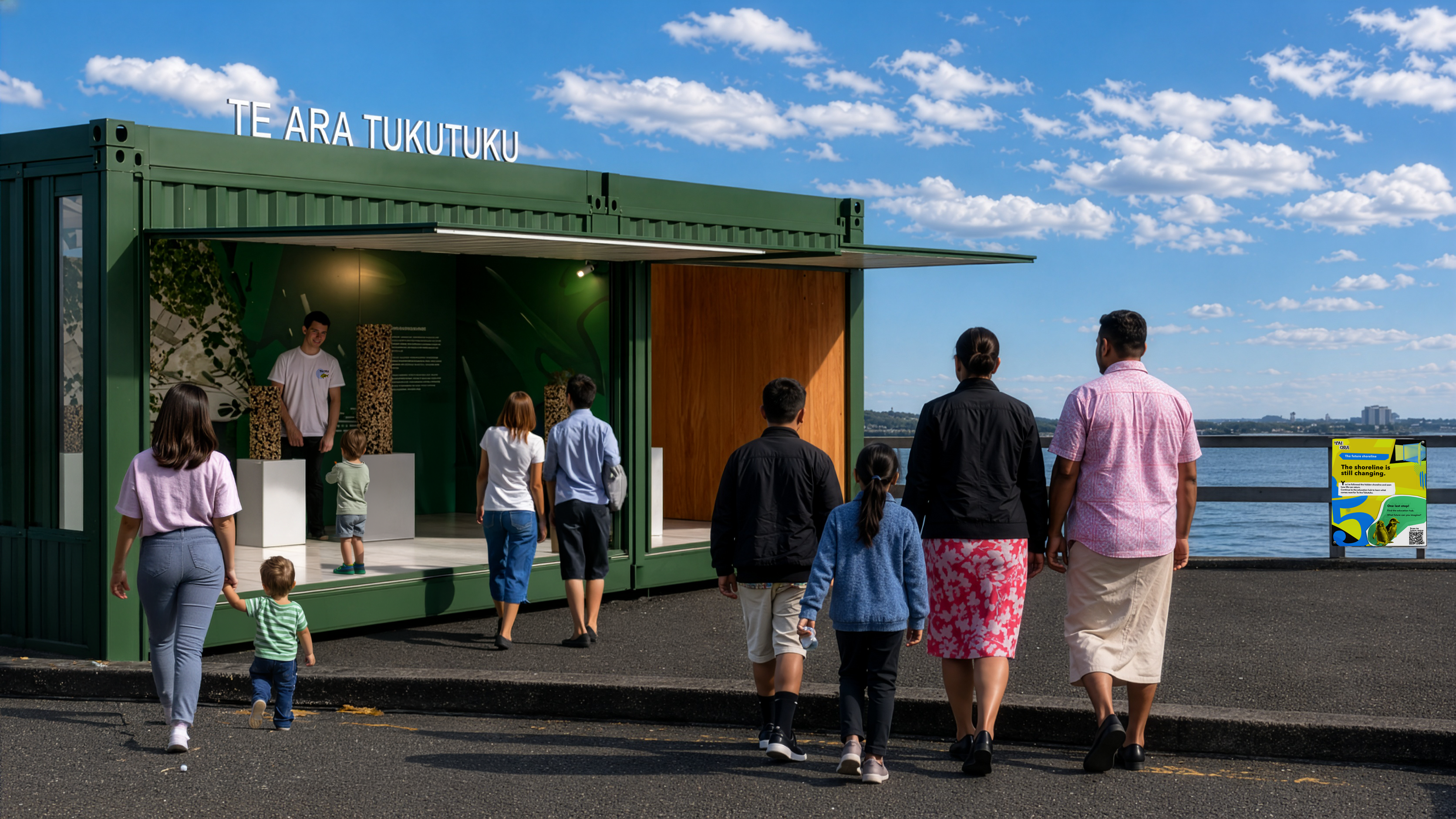
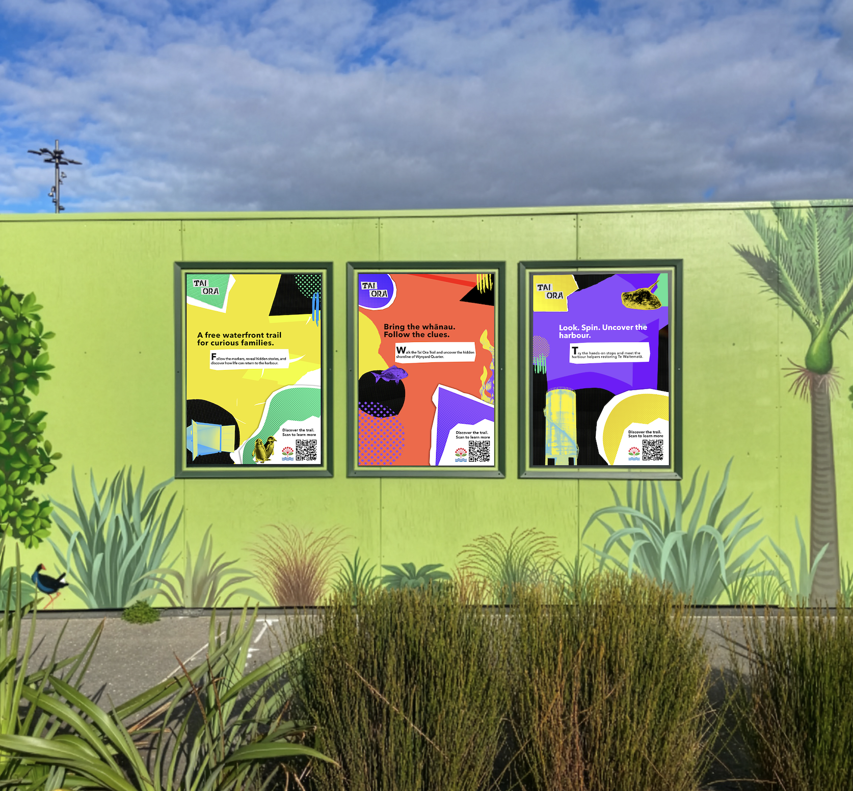
I designed an additional poster to extend the Tai Ora promotional series, then refined the mockups in Photoshop to improve quality, correct AI inaccuracies, and show the posters within the Te Ara Tukutuku site context.
Additional poster and refined mockup series — promotional collateral for the Te Ara Tukutuku site wall.
The final output brought together the trail signage system, story markers, directional and safety signage, the companion mobile website, and promotional collateral into a cohesive visitor experience — connecting people to the restoration of Te Ara Tukutuku through physical and digital touchpoints.
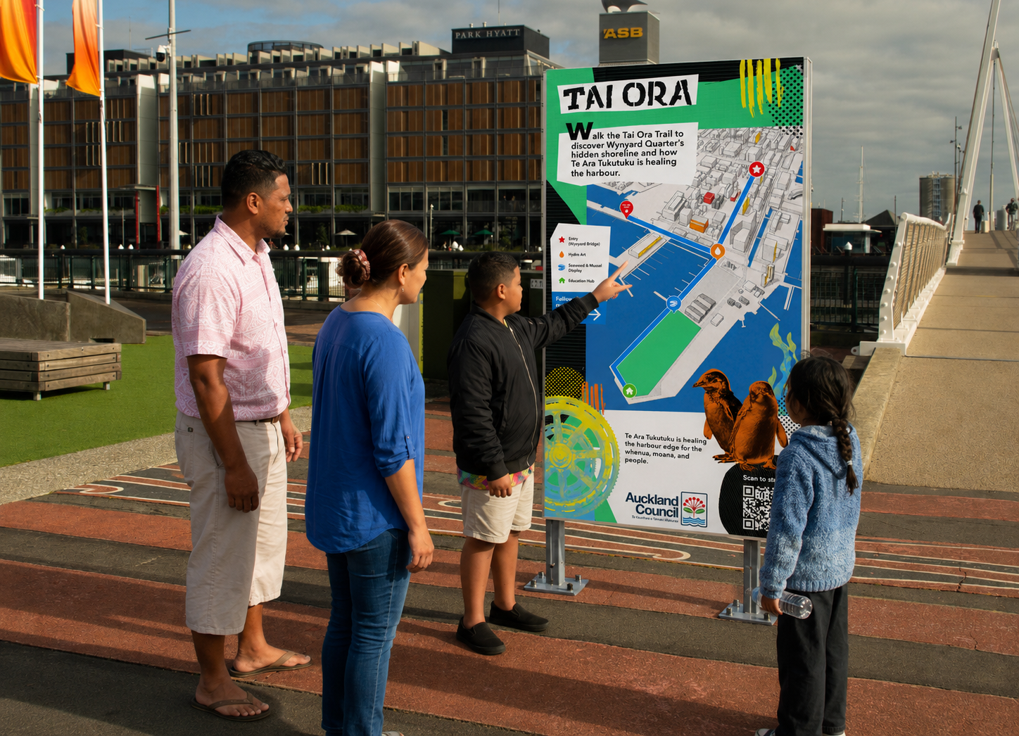
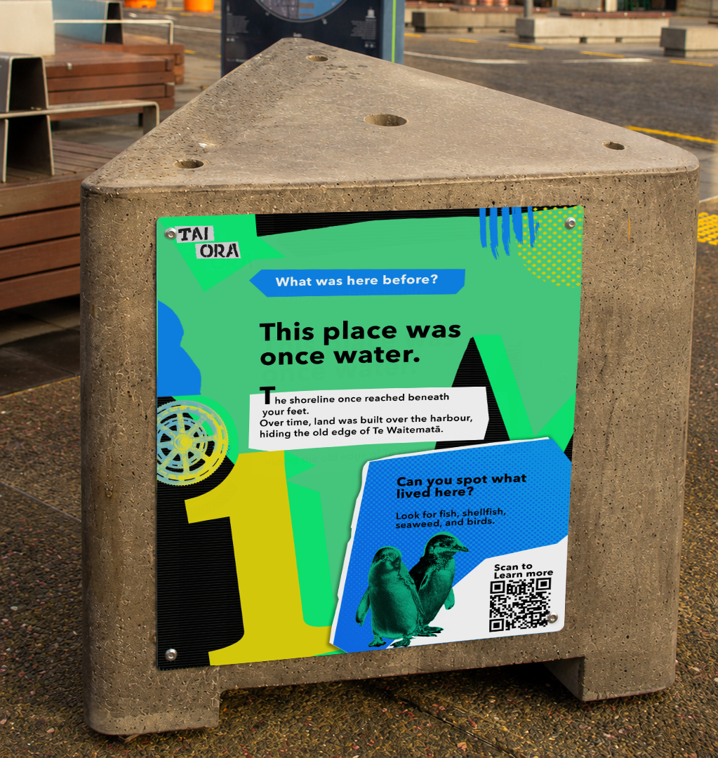
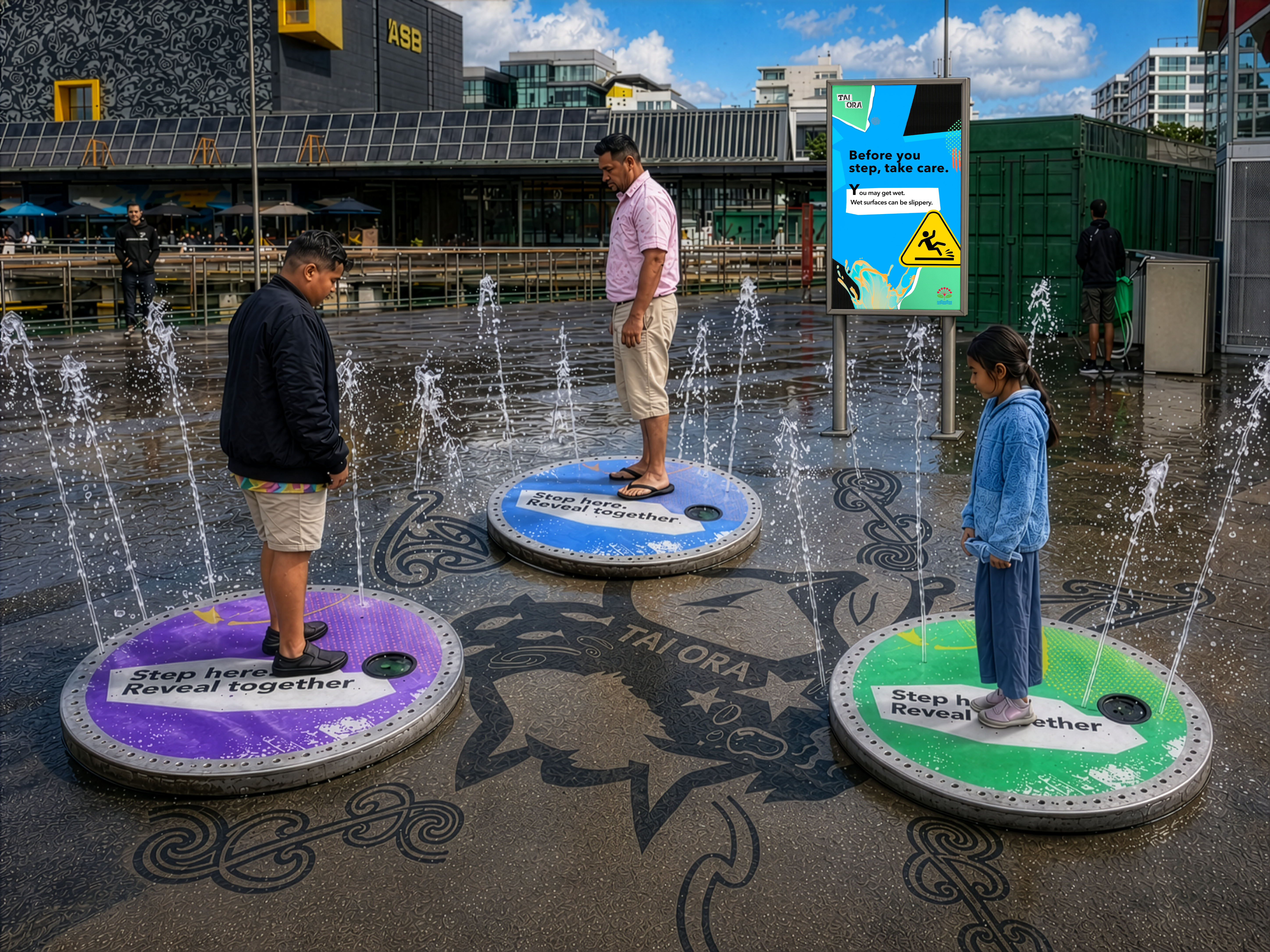
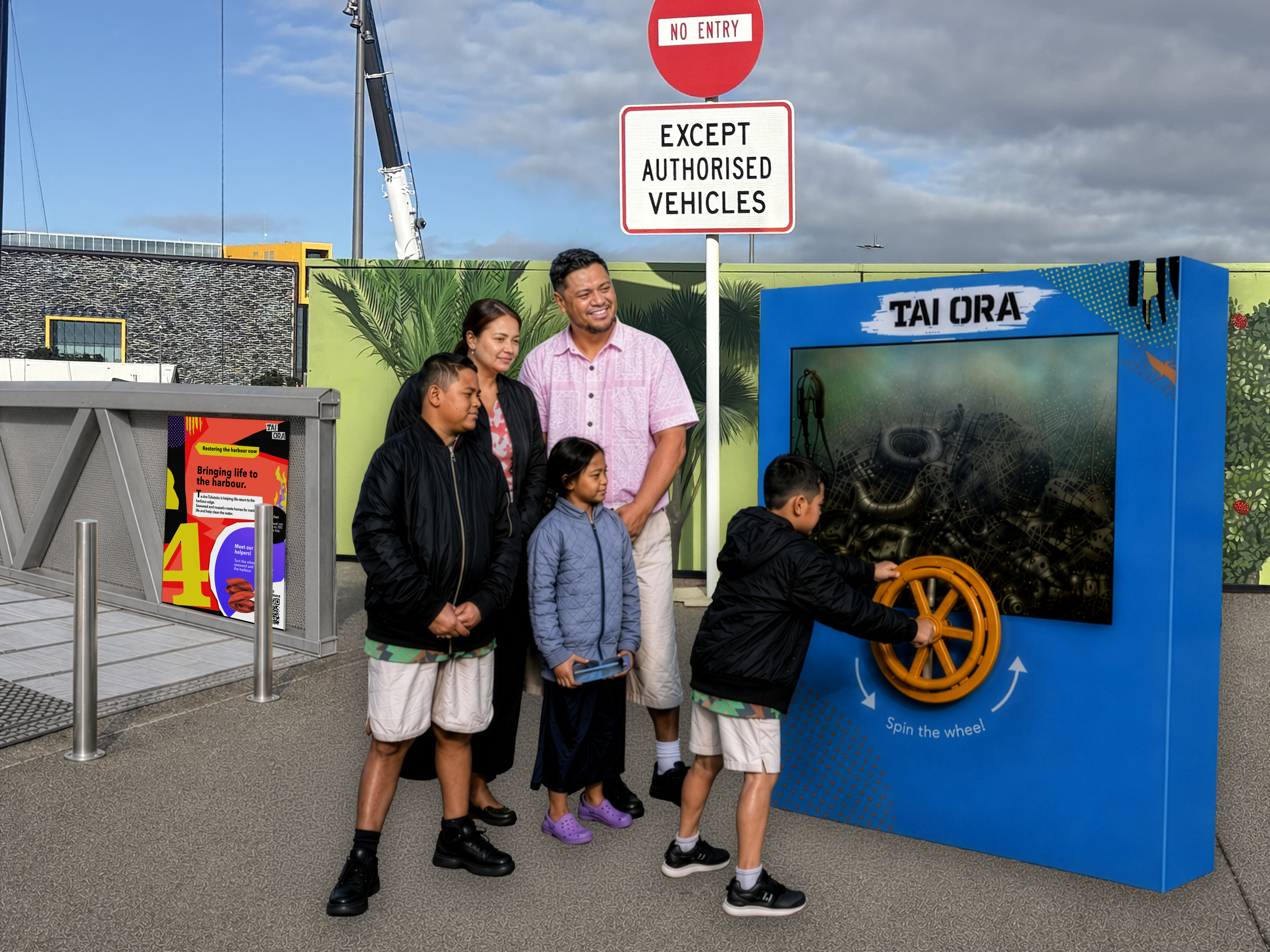
Short motion mockups showed how visitors could physically interact with Tai Ora — revealing hidden moana life, activating hydro-art, and engaging with the seaweed and mussel restoration story. These interaction points were designed by the motion designer and another UX/UI designer. My role was to connect them into the wider trail journey through signage, wayfinding, copy, mobile website flow, and final mockups.
Hydro-art reveal — when visitors step on the plates together, water sprays out to reveal a hidden artwork of species that once lived in the harbour and that Te Ara Tukutuku hopes to return through restoration.
Ecosystem display — turning the wheel represents the effort of restoring marine habitats, revealing how mussels and seaweed filter and heal the water. The display is printed on recycled paper rather than a screen — an intentional, low-impact material choice.
Tai Ora taught me that experience design extends far beyond screens. Designing for a physical trail meant thinking about how people move through space, what they notice in passing, and how to communicate meaning without stopping anyone in their tracks. The signage had to do a lot of quiet, purposeful work.
As Producer I also saw how much project structure shapes creative output. Managing the timeline, setting weekly milestones, and keeping the team focused through a significant concept shift — from campaign to trail — all directly influenced what we were able to deliver.
Looking ahead, Tai Ora can grow alongside Te Ara Tukutuku — adding new regeneration topics and stories, expanding the hydro-art interaction, and developing the website further.