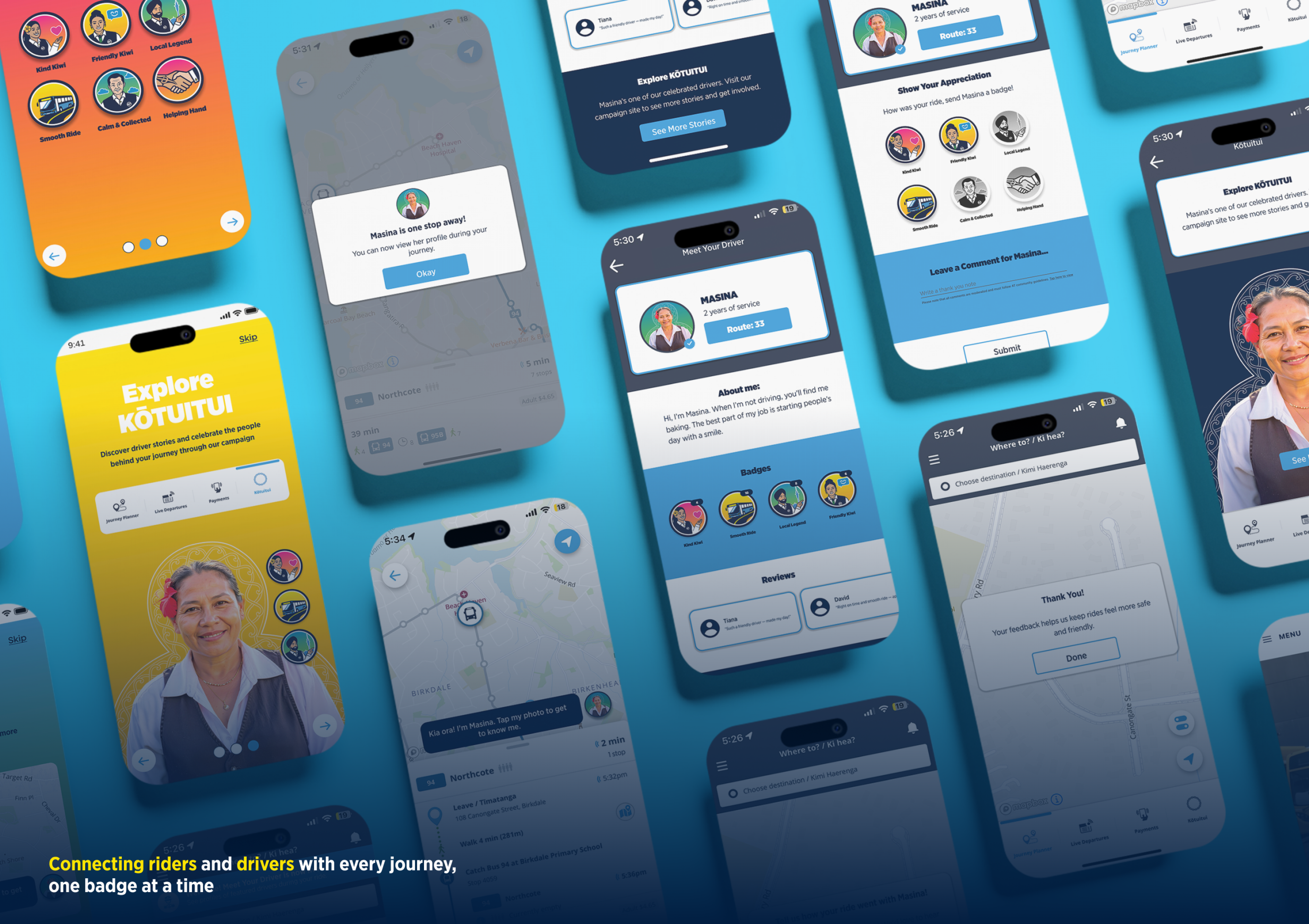
An Auckland Transport safety campaign and app redesign helping riders feel emotionally safe by making drivers more visible, recognised, and connected.
Auckland Transport wanted to improve how safe people felt on public transport and encourage more positive passenger behaviour. As Team Lead, I helped manage the project from brief to final delivery while contributing directly to the rider app, driver app, and badge system.
AT had safety tools in place — CCTV, Transport Officers, Crime Stoppers, and reporting systems — but many riders did not notice them, could not access them in the moment, or did not feel reassured by their presence. The gap was between what AT was doing and what riders actually felt.
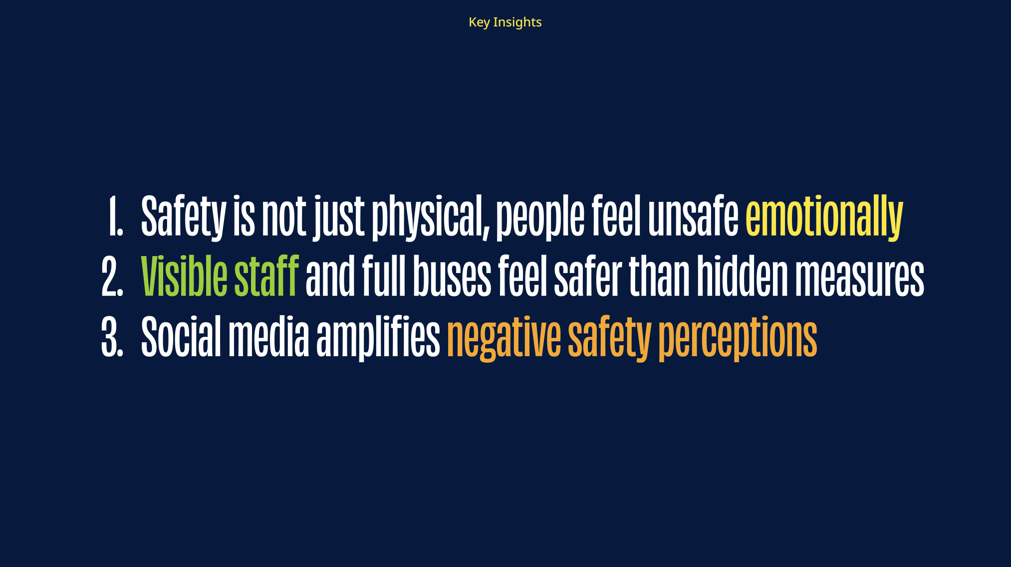
Primary interviews and safety research showed that the barrier was emotional, not just physical. Riders didn't only want safety tools to exist — they wanted to notice them, understand them, and feel reassured by them during the journey.
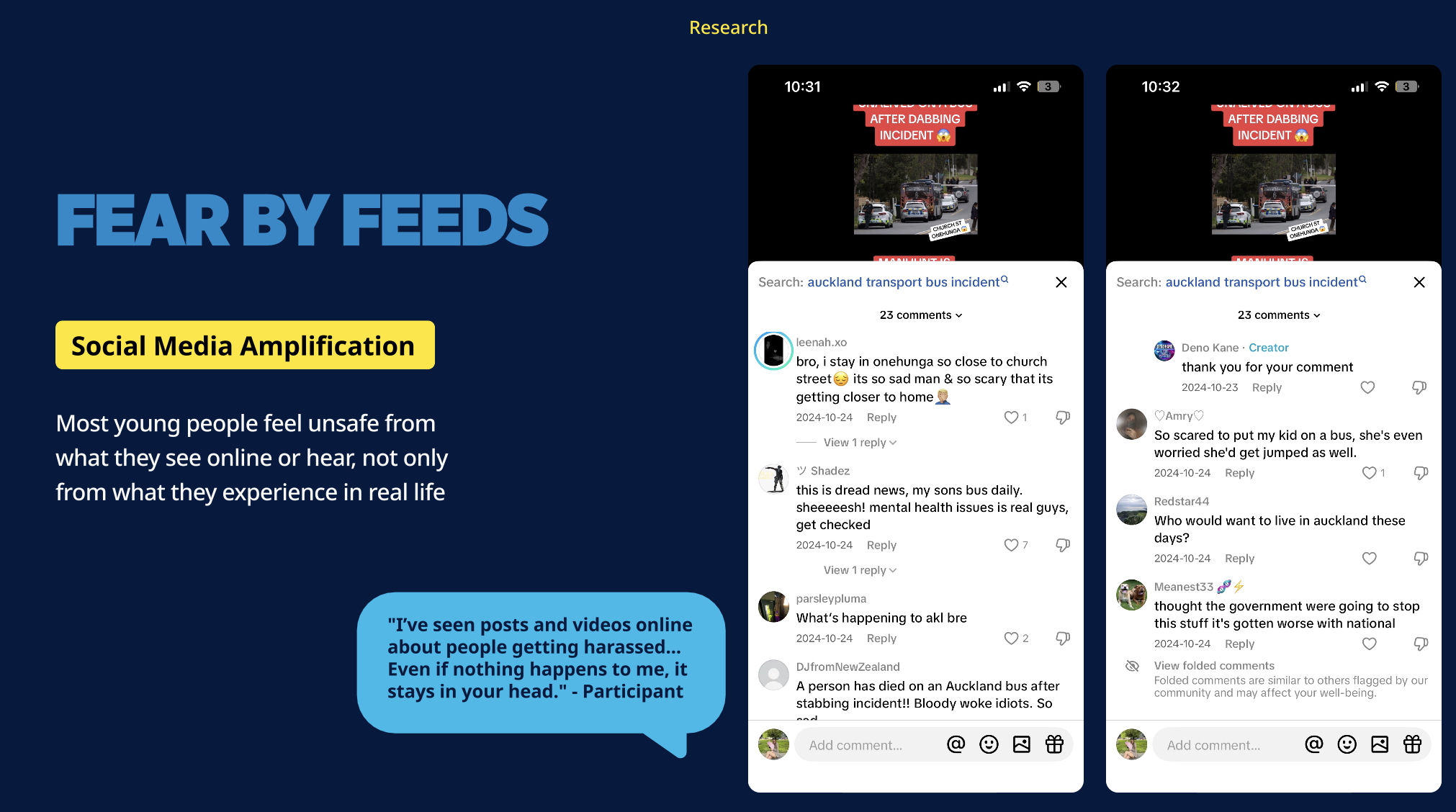
We also found that social media was amplifying negative safety perceptions, making feelings of unsafety spread faster than real incidents.
Kōtuitui was designed for young Auckland riders aged 18–25, especially students, young workers, and people travelling alone or at night. Many rely on their phones during journeys and value visible signs of safety, staff presence, and reassurance.
The system also considers drivers, giving them a way to be recognised for positive behaviour and become a more visible, trusted part of the safety experience.
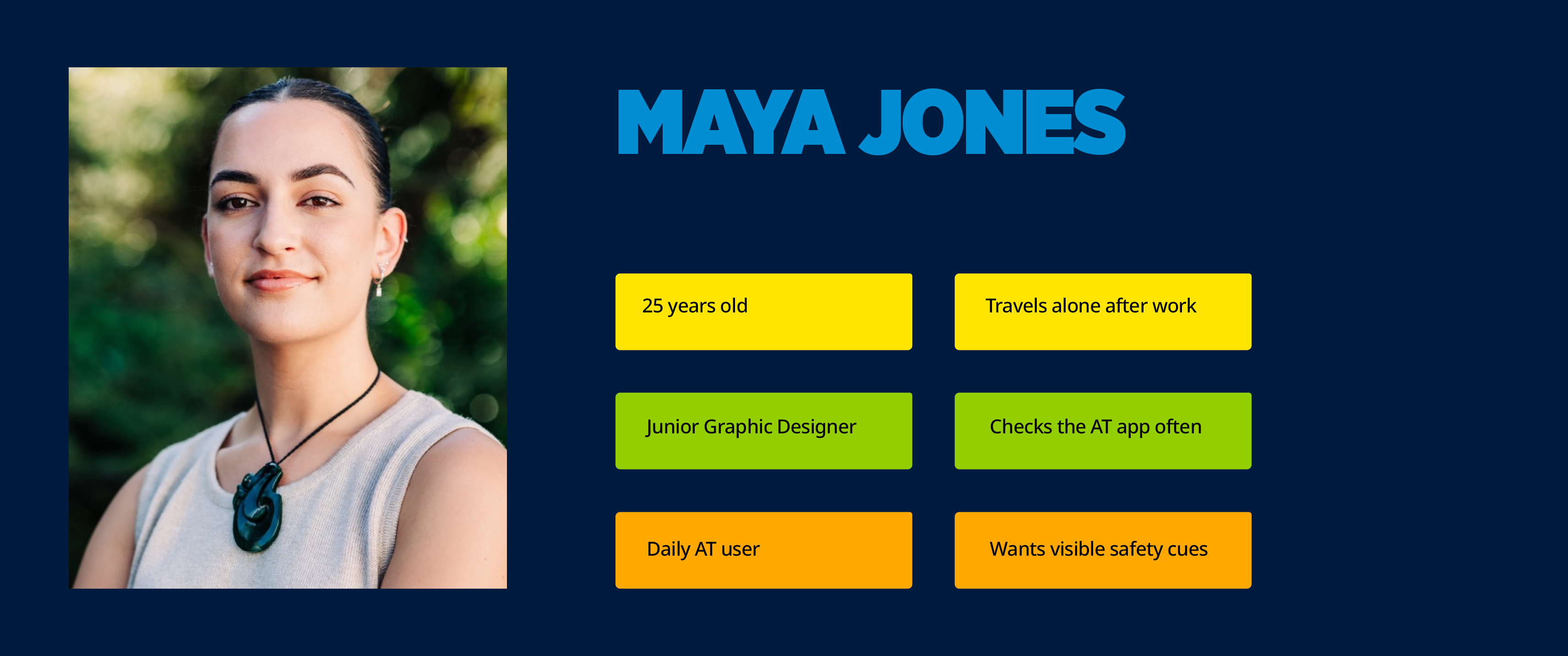
Maya does not just need safety tools to exist — she needs to see and feel them during her journey.
Kōtuitui means to connect, interlace, or link together. The concept reframed safety as connection — helping riders see who was driving, recognise positive behaviour, and feel that real people were part of their journey.
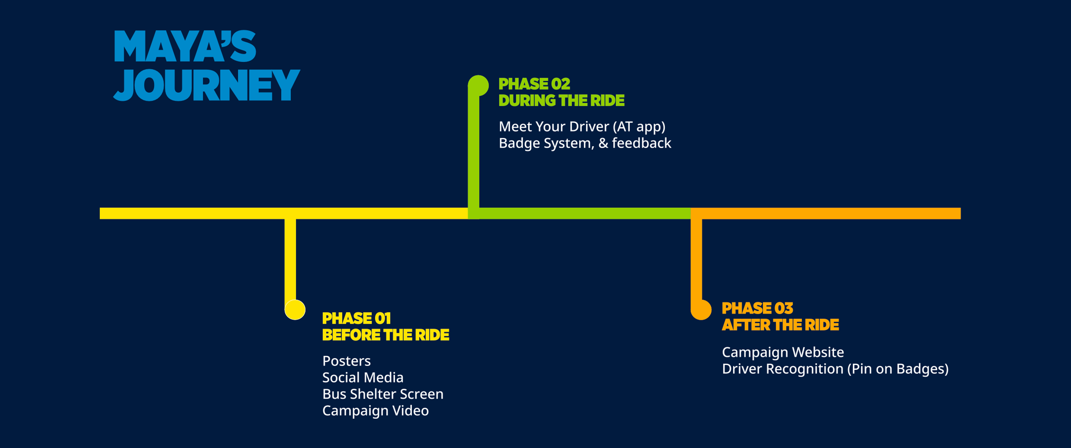
As Team Lead, I managed the project timeline, weekly tasks, and team milestones. As UX/UI Designer, I led the rider app, driver app, and badge system — the three deliverables at the core of the Kōtuitui experience.
I mapped the Kōtuitui experience from both the rider and driver side, showing how one rider action could become visible recognition for the driver. This helped connect the app redesign, feedback flow, and badge system into one complete safety experience.
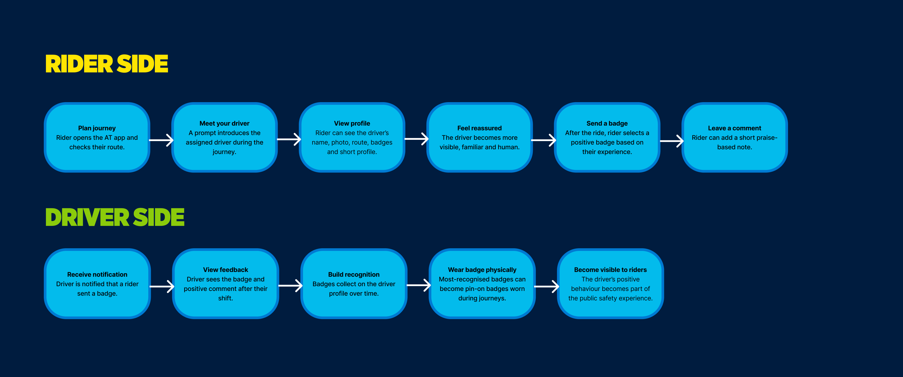
Rider and driver system flow showing how in-app feedback becomes visible recognition in the physical journey.
I redesigned key sections of the AT app to make safety tools easier to access in the moment. The rider flow focused on visibility, speed, and emotional reassurance — introducing the driver as a real person before and during the journey.
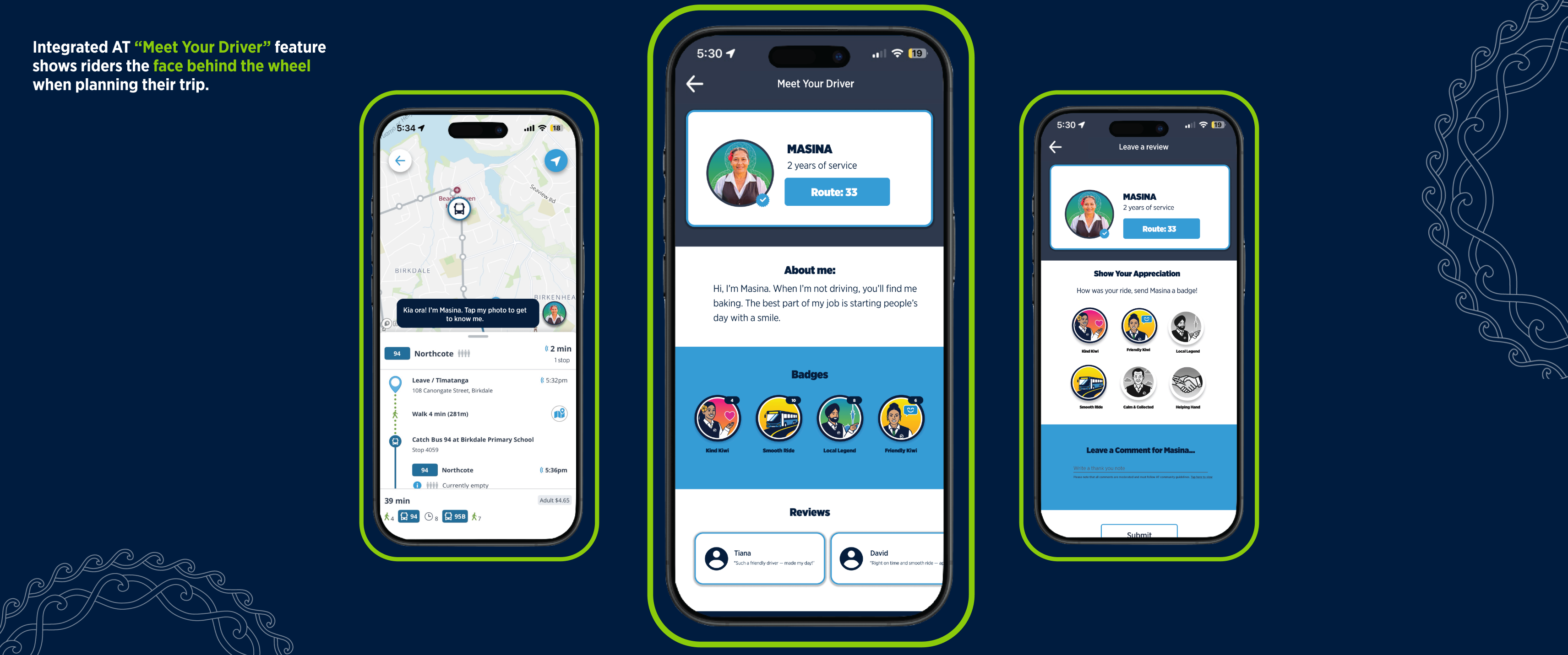
I also designed the driver-side experience, allowing drivers to receive badges, manage their profile, and track recognition over time. This made Kōtuitui a two-sided system: riders felt reassured, while drivers felt seen and valued.
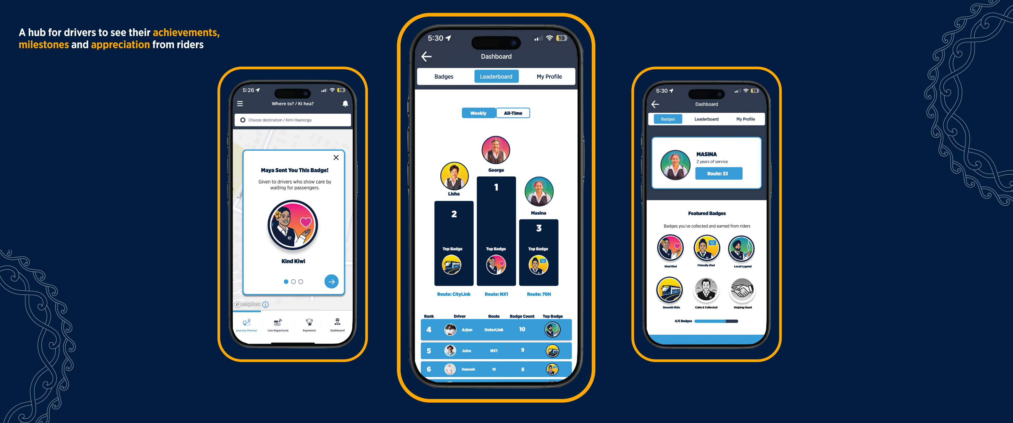
Driver dashboard — badge notifications, leaderboard ranking, and profile management.
The badge system turned positive rider feedback into visible recognition. Digital badges appeared in the app, while physical pin-on badges helped drivers become more recognisable and approachable in the transport environment.
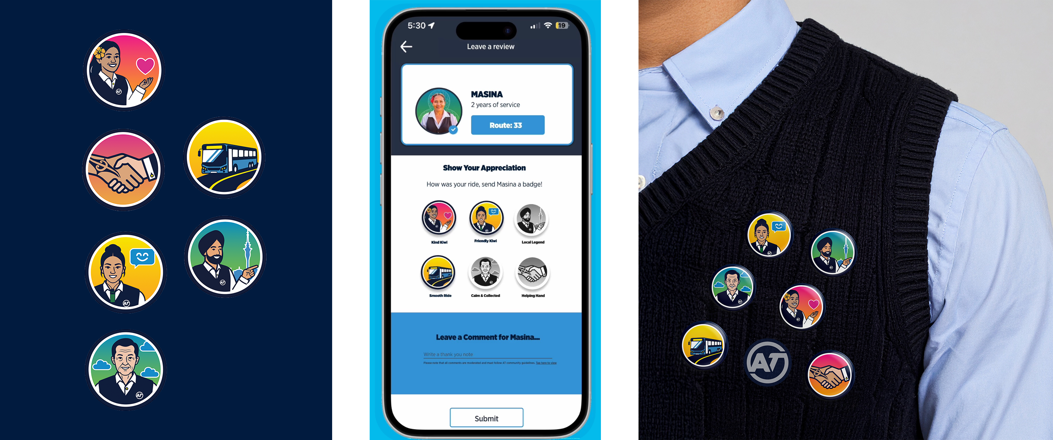
Digital and physical badge system — connecting in-app recognition to the real transport environment.
User testing showed that the Kōtuitui feature needed clearer navigation, more spacing, stronger campaign access, and visible verification cues. I refined the app flow so users could better understand when the driver profile appears and how to access support or campaign content.
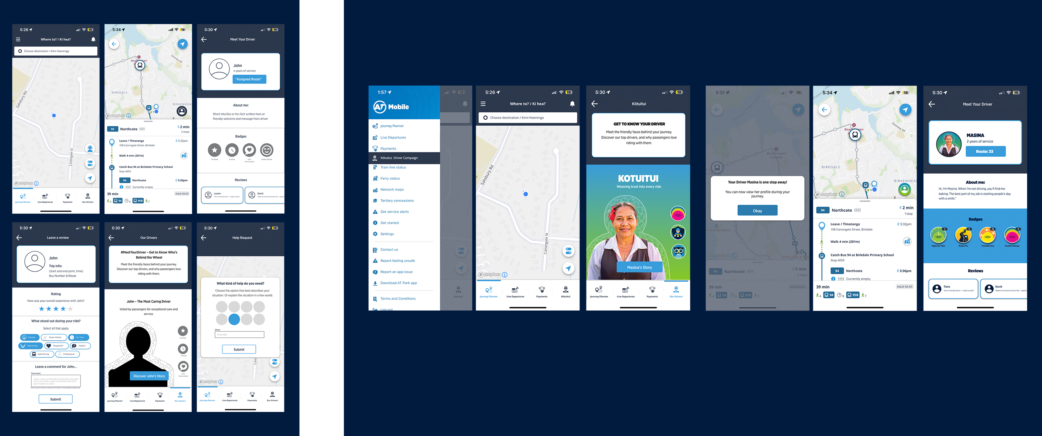
Lo-fi to hi-fi — refining navigation, spacing, and verification cues based on user feedback.
The final Kōtuitui system connected rider reassurance, driver recognition, and campaign visibility into one cohesive safety experience. The app made safety visible in the moment, while the badge system extended that recognition into the physical journey.
Meet Your Driver flow
Badge selection flow
Review & comment flow
Campaign link — profile flow
Campaign link — bottom nav flow
Driver app flow walkthrough
Hi-Fi prototype — Rider & Driver App
The wider campaign extended Kōtuitui across posters, bus shelters, social media, and a campaign website — helping the message appear before, during, and after the ride.
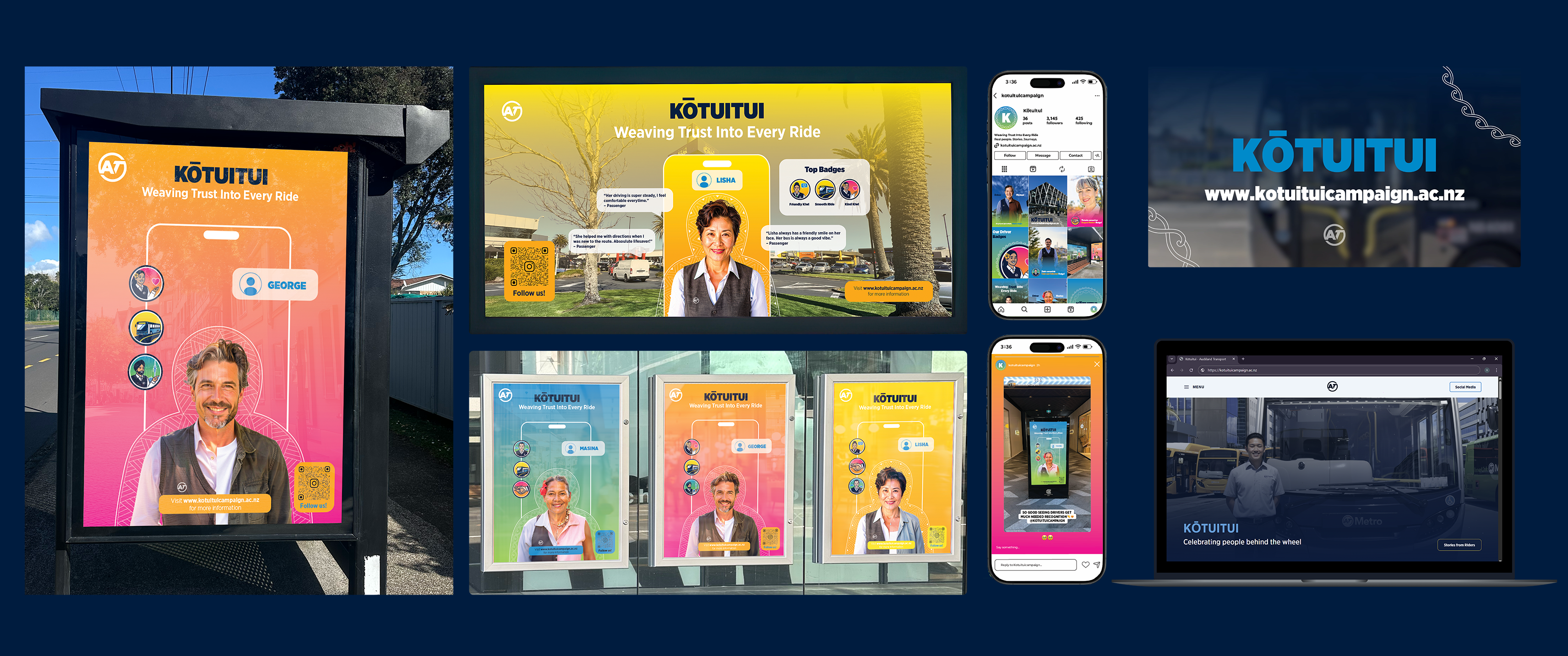
Digital posters
Campaign website
Social media
Bus shelter screen
Campaign video
As Team Lead, I learned that leadership is not only about organising tasks, it is about keeping the concept focused, helping the team make decisions, and making sure each discipline connects back to the same insight.
As a designer, Kōtuitui taught me that safety is not always solved by adding more features. Sometimes the most meaningful design move is making what already exists feel visible, human, and easy to trust.